Now Reading: Customer Service Dashboard Metrics and KPIs (Improving Support)
-
01
Customer Service Dashboard Metrics and KPIs (Improving Support)

")
Purpose and scope of a customer service dashboard
A customer service dashboard is a centralized view that consolidates performance data from multiple channels, systems, and teams to help managers steer support operations. It translates raw data into actionable insights, enabling faster decision-making, smarter coaching, and a more consistent customer experience. The dashboard typically covers metrics related to response speed, issue resolution, customer sentiment, channel efficiency, and cost drivers, while offering the flexibility to drill down by team, product line, or region.
In practice, the dashboard should align with business objectives and be tailored for the intended audience—frontline agents, team leaders, operations managers, and CX executives. It must balance real-time indicators with longer-term trends, provide context through benchmarks, and support escalation paths. A well-scoped dashboard reduces noise, highlights critical bottlenecks, and helps organizations act quickly rather than simply observe data.
Core metrics every support team should track
A practical starting point is to define a core set of metrics that reflect whether customers are being helped promptly, effectively, and satisfactorily.
- Average first response time (AFRT)
- Average resolution time
- First contact resolution rate (FCR)
- Customer satisfaction (CSAT)
- Net promoter score (NPS)
- Abandonment rate
- Backlog size and aging
- Tickets closed per agent per period
- Channel mix and throughput
When selecting metrics, consider the audience; executives may focus on trends and ROI, while frontline managers focus on workload and agent performance. Metrics should be clearly defined, consistently measured, and aligned to the service level agreements (SLAs) and customer expectations of your organization. Start with a core set, and expand thoughtfully as data quality improves and the team gains confidence in the measurements.
Leading and lagging indicators, and how to interpret them
Leading indicators are metrics that provide early signals about future performance, such as queue length, average wait time, or agent occupancy. These indicators help teams anticipate bottlenecks before customers are impacted and support proactive staffing or process adjustments. Lagging indicators, by contrast, show outcomes after the fact, like CSAT, NPS, or resolution quality, and are essential for understanding the effectiveness of your processes once work has completed.
A healthy dashboard blends both types of indicators to create a balanced view. Leading metrics can trigger corrective actions in near real time, while lagging metrics verify whether those actions translated into improved customer experiences. When interpreting metrics, look for correlations—does an uptick in first reply time correlate with lower CSAT, for example? This kind of analysis informs coaching, process changes, and technology investments, and it helps set realistic targets grounded in historical performance and industry context.
Data sources, integration, and data quality considerations
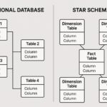
A reliable dashboard rests on trustworthy data. The typical sources include the ticketing system, CRM, telephony, chat and messaging platforms, email management, customer surveys, knowledge-base analytics, and social media monitoring. Each source contributes a different perspective on the support ecosystem, so clear mapping and consistent definitions are essential for meaningful comparisons across channels and teams.
- Ticketing system (e.g., Zendesk, Freshdesk, ServiceNow)
- Customer relationship management (CRM) system
- Telephony and IVR platforms
- Live chat and messaging platforms
- Email management systems
- Customer feedback tools and surveys
- Knowledge base analytics and self-service data
- Social media monitoring and public forums
To maximize quality, implement integration practices that ensure synchronized timestamps, standardized field mappings, and robust deduplication. Regular audits of data completeness, freshness, and accuracy help prevent discrepancies that can erode trust in the dashboard. Establish data lineage so stakeholders understand where each metric originates and how it is transformed along the way.
Dashboard design and usability best practices
Design clarity is paramount. Create a clean information hierarchy that prioritizes the most important metrics and uses consistent visual encodings (colors, shapes, and icons) to reduce cognitive load. Provide context for each metric with target lines, historical trends, and the ability to drill down into time ranges or subgroups such as channel, product line, or issue type. The layout should support quick scanning for executives and allow deeper exploration for operators and team leads without overwhelming the user with noise.
Tailor dashboards to the roles that rely on them. For frontline staff, provide actionable views that highlight urgent tickets and workload distribution. For managers, emphasize performance trends, capacity planning, and quality indicators. For executives, focus on strategic metrics, ROI of support initiatives, and customer sentiment signals. Accessibility considerations—such as color-blind friendly palettes and readable typography—are essential to ensure the dashboard serves all users effectively.
Governance, security, and privacy considerations
As dashboards surface data across teams and customer interactions, governance and privacy become critical. Implement role-based access controls to ensure that sensitive information, such as PII, is visible only to authorized users. Establish data retention policies that balance operational value with compliance requirements, and maintain audit trails to track who accessed or changed dashboard configurations and data sources. Regular reviews of data use, consent, and reporting scope help prevent unintended exposure of customer information while still enabling meaningful insights.
Incorporate privacy-by-design principles when collecting feedback and monitoring customer interactions. Anonymize or aggregate data where possible, and ensure that any sentiment analysis or profiling complies with applicable regulations (for example, GDPR or CCPA). Build a culture of responsible data usage among stakeholders and provide ongoing training on data governance practices to sustain a trustworthy analytics environment.
Implementation, adoption, and ongoing optimization
A structured approach to rollout increases the odds of achieving tangible improvements from your dashboard. Start with a focused scope, validate data quality, and secure executive sponsorship to align incentives and reinforce adoption. The plan should emphasize repeatable processes, clear ownership, and continuous learning to adapt the dashboard as needs evolve and as new data becomes available.
- Define success criteria and align with stakeholders across product, CX, and operations
- Inventory data sources, map metrics to business goals, and verify data quality
- Select tools, architecture, and deployment approach that fit your organization
- Build an MVP that includes the core metrics and essential drill-down capabilities
- Run a pilot with a representative user group, collect feedback, and iterate
- Roll out organization-wide with training, governance, and change management
After deployment, establish a cadence for review and optimization. Schedule regular updates to reflect changes in processes, product lines, or channel strategies. Encourage user feedback as a continuous input for improving metric definitions, thresholds, and visualization choices. By treating the dashboard as a living instrument rather than a static report, teams can sustain momentum and translate insights into concrete performance gains.
Benchmarks and industry context
Benchmarks provide a reference point for performance and help identify opportunities for improvement. While industry averages vary by sector, region, and support model (in-house, outsourced, or hybrid), you can use benchmarks to anchor targets, prioritizing changes that deliver meaningful customer impact and operational efficiency. Context matters: a high volume, low-complexity support environment may have different optimal targets than a high-value, high-complexity operation. Use internal trend analysis, peer comparisons within your industry, and longitudinal studies to set realistic, aspirational goals and to track progress over time.
Remember that dashboards should guide action, not merely report data. Pair metrics with improvement initiatives, such as process redesign, automation opportunities, or agent coaching programs. Regularly recalibrate targets to reflect changes in customer expectations, product availability, and market conditions. A disciplined approach to benchmarking—combined with disciplined execution—helps sustain durable improvements in both support performance and customer experience.
FAQ
What is the most important metric on a customer service dashboard?
The most important metric depends on your current objectives and context, but in many cases, a balance between responsiveness and effectiveness matters most. A commonly critical pair is first response time and first contact resolution rate, because they reflect both speed and initial solution quality. However, CSAT or NPS should also be included to ensure that speed does not come at the expense of customer satisfaction. The best practice is to identify a small set of core metrics that directly align with your strategic goals and monitor them continuously.
How often should a dashboard be refreshed?
Refresh frequency should reflect the decision-making needs of your audience and the operational realities of your support environment. Real-time or near-real-time updates are valuable for live queue management and intra-shift staffing, while daily or hourly refreshes can support trend analysis and SLA adherence monitoring. For strategic insights, weekly or monthly refreshes paired with quarterly reviews often suffice. The key is to ensure data freshness is consistent and clearly communicated to dashboard users so decisions are based on current information.
How do you avoid dashboard metric overload?
Start with a concise, well-structured core set of metrics that directly tie to business goals. Use clear visual encodings, avoid duplicative measures, and group related metrics by theme or channel. Provide drill-down capabilities so users can explore areas of interest without cluttering the main view. Establish governance around metric definitions and targets, and periodically prune or retire metrics that no longer inform decision-making. A focused dashboard reduces cognitive load and increases actionability.
How can dashboards support agent coaching?
Dashboards enable data-driven coaching by surfacing individual and team performance trends, workload patterns, and quality indicators. By pairing metrics with contextual comments, supervisors can identify coaching opportunities—such as improving first contact resolution, reducing handle time without sacrificing quality, or improving CSAT in specific channels. Regularly sharing insights from the dashboard in coaching sessions helps agents understand expectations, track progress, and feel supported by a transparent, objective framework.
How to handle data privacy on dashboards?
Protect customer privacy by applying data minimization, aggregation, and anonymization wherever possible. Use role-based access control to limit visibility of sensitive fields (PII) to authorized users, and implement data masking where appropriate. Maintain clear data retention policies and obtain necessary consents for analytics in line with applicable regulations. Regularly review dashboard configurations for potential privacy risks and provide training for users on compliant data handling practices.