Now Reading: HR Dashboard Examples for Modern HR Teams
-
01
HR Dashboard Examples for Modern HR Teams
HR Dashboard Examples for Modern HR Teams
What HR dashboards deliver for modern teams
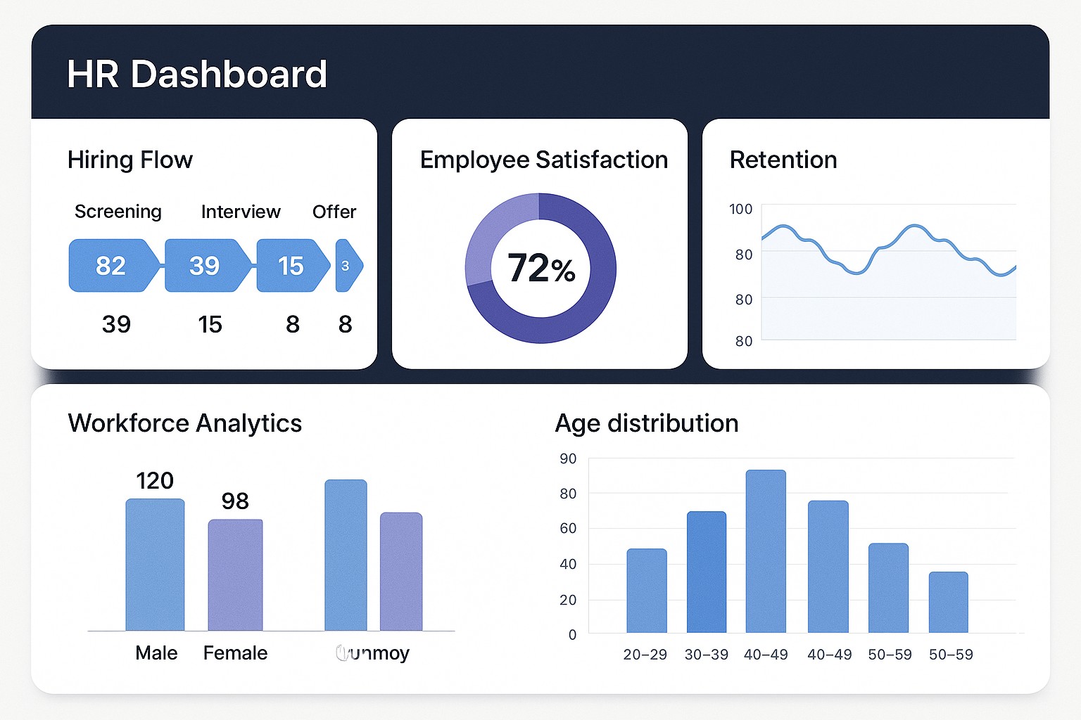
In modern HR operations, dashboards turn disparate HRIS, applicant tracking systems (ATS), and learning management data into a single, actionable view for leaders. They help you monitor the health of the workforce, detect emerging risks, and compare performance across departments and time. A well designed HR dashboard answers questions such as where we stand now, where we are headed, and which levers will most effectively move the needle for business outcomes.
When dashboards are aligned with business strategy, they translate people data into concrete decisions about hiring priorities, training investments, and retention strategies. Real time dashboards support quick responses to spikes in turnover in high risk teams, while batched dashboards support longer term planning and governance reviews. To maximize value, select KPIs that reflect both outcomes and the levers that influence them.
- Turnover rate (voluntary and involuntary)
- Time to fill
- Time to productivity
- Cost per hire
- Quality of hire
- Training completion rate
- Training effectiveness or impact on performance
- Offer acceptance rate
- Recruitment funnel conversion rate
- Employee engagement score
- Absence rate
- Diversity metrics
- Compliance training completion
Key KPI categories to structure your dashboards
Dashboards work best when metrics are organized into domains that map to the HR lifecycle and to business goals. Clear categories help owners set targets, prioritize actions, and communicate impact to executives and teams alike.
Below are core categories that teams commonly use to structure their dashboards.
- Talent Acquisition and Recruitment
- Retention, Engagement, and Attrition
- Learning and Development
- Performance, Productivity, and Potential
- Compliance, Risk, and Well-being
Design patterns and visual storytelling for HR dashboards
Design patterns help ensure dashboards are understandable, trustworthy, and actionable for stakeholders across levels. A well crafted HR dashboard tells a story with data while guiding users to take appropriate next steps.
Consider these patterns to maximize clarity and adoption.
- Time series trend lines to show trajectories of key metrics over quarters or years
- Bar charts for headcount by department or location to enable quick comparisons
- Heatmaps that reveal risk hotspots by team, location, or tenure
- Funnel visualizations for recruitment stages to identify bottlenecks
- Scorecards or gauges that track KPI attainment against targets
Industry examples by function and use cases
Industry examples demonstrate how dashboards translate data into decisions across core HR functions. A practical approach is to map three representative functions to the metrics and visuals most often used to drive action.
Below is a compact, cross-functional mapping you can adapt. The aim is to pair the right KPI with a visualization and a cadence that supports timely decisions.
Function: Recruitment
Typical KPI: Time to fill, Cost per hire
Visualization: Funnel + stacked bar
Refresh: Daily

Function: Learning and Development
Typical KPI: Training completion rate, Average training hours
Visualization: Bar chart, Gauge
Refresh: Weekly

Function: Engagement and Retention
Typical KPI: Employee engagement score, Turnover rate
Visualization: Line chart with area
Refresh: Monthly
From data sources to decision cycles: governance and workflow
The value of dashboards depends on trusted data and clear governance. Common data sources include the HR information system (HRIS), applicant tracking system (ATS), learning management system (LMS), payroll, time and attendance, and performance management tools. Establish data lineage so users understand where each metric comes from, and designate data owners who are accountable for accuracy and timeliness.
Beyond data quality, you should implement role based access, standardize metric definitions, and set escalation paths for data quality issues. A lightweight operating rhythm that includes regular reviews with owners, feedback loops from end users, and clear actions tied to dashboard insights helps translate visibility into disciplined action.
Practical steps to start building HR dashboards
Begin with a clear objective that connects workforce metrics to business outcomes. Inventory data sources, define baseline KPI definitions, and select a focused pilot scope. Engage a mix of stakeholders early to validate the metrics and visuals, then iterate based on their feedback. As you scale, invest in governance, automation, and user training to sustain adoption.
To ensure successful rollout, establish simple, repeatable processes for data refresh, metric definitions, and access controls. Treat dashboards as living documents that evolve with changes in business strategy, not as one off reports. The strongest dashboards are those that teams trust, understand, and act upon consistently.
FAQ
What are the most important KPIs for HR dashboards?
The most impactful KPIs typically include turnover (overall and by category), time to fill, cost per hire, employee engagement, training completion rate, and quality of hire. However, the precise set should reflect the company’s strategic priorities and the stage of the workforce strategy, with additional metrics added to illuminate recruiting efficiency, learning impact, and retention risk as needed.
How often should HR dashboards refresh?
Refresh cadence should align with data source capabilities and decision needs. Some metrics may require real time or near real time updates (for example, recruiting funnel and headcount changes), while others can be refreshed daily or weekly (such as engagement or training completion). At minimum, establish a cadence that keeps leadership informed without creating noise from stale data.
Who should have access to HR dashboards?
Access should be role based. Executives and HR leadership typically require broad visibility across all domains, managers need detail for their teams, and individual contributors may access only self service data. Implement views that protect sensitive data while enabling the right people to act on insights in a timely manner.
How can dashboards drive action without creating data overload?
Focus on a small set of leading indicators per view, provide clear targets, and use alerts or thresholds to surface exceptions. Complement numeric data with concise narrative context and recommended actions, so users know what to do next rather than merely what happened.
What common pitfalls should teams avoid when building dashboards?
Avoid overloading dashboards with metrics, inconsistent definitions, and a lack of data governance. Ensure alignment with business strategy, verify data quality, and invest in stakeholder engagement. Start small with a usable pilot, then scale thoughtfully as adoption grows and requirements stabilize.
