Now Reading: Interactive Data Visualization: Techniques and Tools
-
01
Interactive Data Visualization: Techniques and Tools


Understanding Interactive Data Visualization
Interactive data visualization refers to the practice of presenting data through graphical representations that respond to user input. Rather than delivering a static image or chart, interactive visuals invite users to explore, filter, zoom, and adjust parameters in real time. This capability is particularly valuable when dealing with complex datasets or multi-dimensional questions, where insight emerges from the process of asking questions and iterating on hypotheses. In business contexts, interactivity turns dashboards from passive reports into dynamic decision-support tools, enabling stakeholders to investigate trends, test “what-if” scenarios, and validate assumptions without relying on data engineers or analysts for every exploration.
At a fundamental level, interactivity combines well-designed visual encodings with responsive controls. The core design goal is to preserve clarity while offering meaningful ways to engage with the data. Good interactive visuals provide intuitive mechanisms for users to filter out noise, highlight relevant patterns, and link adjacent charts so that actions in one view reflect across the entire visualization stack. When done well, interactivity reduces cognitive load, accelerates discovery, and aligns diverse teams around a shared, exploratory language that supports evidence-based decision making.
Benefits for Business and User Engagement
Organizations increasingly adopt interactive visualizations to accelerate insight, improve decision making, and foster data literacy across roles. Interactive dashboards empower executives to monitor key performance indicators in context, analysts to drill into anomalies, and front-line teams to customize views that reflect their daily workflows. The resulting speed of insight often translates into faster course corrections, better resource allocation, and stronger alignment between strategy and execution. By enabling stakeholders to interact with the data directly, businesses reduce dependence on centralized reporting and increase the likelihood that decisions are grounded in up-to-date evidence.
From a user experience perspective, interactivity enhances engagement and retention. When users can manipulate what they see—adjust time ranges, switch metrics, or explore regional breakdowns—the content feels personalized and relevant. This empowerment supports a narrative where data is not just presented but co-created with the user. The best practices in this space emphasize clarity, discoverability, and guided exploration: intuitive defaults, obvious affordances for interaction, and a balance between exploration and storytelling that keeps audiences focused on the business questions at hand.
- Faster time-to-insight through direct data manipulation and immediate feedback.
- Deeper engagement as users tailor views to their specific roles and objectives.
- Improved decision quality via cross-filtering and contextual comparisons.
- Greater data democratization, enabling non-technical stakeholders to explore datasets.
- Stronger alignment and collaboration through shared visual narratives.
- Flexibility to surface insights across a range of devices and environments.
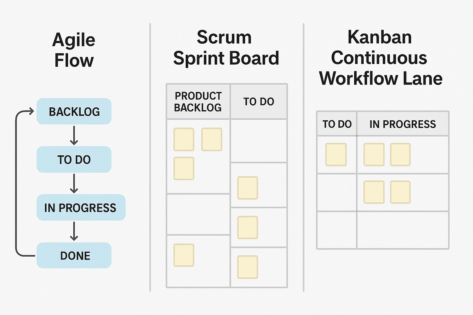
Core Techniques and Interaction Patterns
Effective interactive visuals rely on a set of patterns that support exploration without overwhelming users. Filtering and highlighting allow users to narrow the scope of analysis while keeping other data visible for context. Brushing and linking enable simultaneous exploration across multiple charts, so selecting a data range in one view highlights related observations in others. Drill-down and roll-up patterns offer a natural path between overview and detail, letting users start with a high-level summary and progressively reveal underlying records or segments. Responsive design ensures that interactions remain smooth across devices, from large desktop monitors to touch-enabled tablets and smartphones.
Beyond these patterns, performance-aware techniques are essential when datasets grow large. Techniques such as data aggregation, precomputation of common aggregations, lazy loading, and virtualization help maintain snappy interactions. Thoughtful defaults guide first-time users toward meaningful insights, while accessible controls and clear feedback ensure that interactions are discoverable and interpretable. When designing interactivity, consider the entire user journey: what questions are most likely to arise, how to anticipate those questions with smart presets, and how to gracefully handle cases where data is missing or stale.
// Example: a simple Vega-Lite spec for a linked bar chart with brushing
{
  "data": {"url": "data/sales.csv"},
  "transform": [{"filter": {"field": "region", "equal": "North America"}}],
  "mark": "bar",
  "encoding": {
    "x": {"field": "month", "type": "ordinal"},
    "y": {"field": "sales", "type": "quantitative"},
    "color": {"field": "product", "type": "nominal"}
  }
}
Tools and Ecosystems
There is a broad ecosystem of tools for building interactive visualizations, ranging from lightweight libraries for custom visuals to comprehensive BI platforms. Developers frequently combine lower-level libraries for maximum control with higher-level tooling to accelerate delivery. On the front end, libraries such as D3.js provide fine-grained control over scales, layouts, and transitions, while declarative toolkits like Vega-Lite and Plotly.js offer abstractions that simplify common patterns without sacrificing expressiveness. For teams prioritizing rapid dashboards with strong interactivity baked in, BI-oriented platforms such as Tableau, Power BI, and Apache Superset provide polished experiences and governance features. The choice of toolchain often depends on data volumes, the need for customization, and organizational requirements around security and scalability.
When designing a mixed-ecosystem approach, consider the strengths and trade-offs of each option. Open-source libraries excel at customization and transparency, but may require more development effort and maintenance. Commercial BI tools typically offer robust security, governance, and collaboration features, at the cost of flexibility and potential licensing constraints. A modern approach often combines a core, scalable data layer and a curated set of interactive components built with a flexible library, complemented by a governed BI layer for governance, distribution, and enterprise-ready features. This balance enables both exploratory research by analysts and scalable, auditable dashboards for executives.
- D3.js for custom, highly interactive visual components and fine-grained control over visuals.
- Vega-Lite and Vega for a concise, declarative approach to complex visualizations with good interoperability.
- Plotly.js and Chart.js for production-grade charts with interactive capabilities and good performance.
- Tableau and Power BI for enterprise-grade dashboards, sharing, governance, and collaboration.
- Apache Superset for open-source, scalable visualization at the data-warehouse level with strong integration options.
- Seamless integration patterns (REST/GraphQL data sources, WebSocket streams) to keep visuals current with live data.
Performance and Data Architecture Considerations
Performance is a primary concern when building interactive visualizations, especially as data volume grows or data sources become real-time. Rendering thousands of elements per frame can strain browsers, so architects should consider data reduction techniques, server-side aggregations, and efficient transfer protocols. Streaming data, incremental updates, and delta transmissions help keep visuals responsive without reloading entire datasets. Additionally, thoughtful caching, prioritization of initial render paths, and progressive disclosure of detail help manage perceived performance and user satisfaction.
Data architecture for interactive visuals should emphasize a clean data model, well-defined transformations, and clear boundaries between data sources, preparation, and visualization layers. Pre-aggregation, indexing, and dimensional modeling enable faster queries and simpler visual encodings. Cross-filtering patterns benefit from structured event handling and careful state management to avoid inconsistent or cascading updates. Finally, ensure strategies for data quality, lineage, and versioning so that dashboards remain trustworthy over time and reflect robust governance processes across data teams.
- Pre-aggregation and materialized views to reduce runtime computation in the browser.
- Efficient data transfer using pagination, sampling, or streaming with chunked updates.
- Client-side virtualization and canvas-based rendering for large datasets to maintain smooth interactions.
- Clear data contracts and versioned endpoints to prevent breaking changes in dashboards.
- Caching strategies at multiple layers (browser, CDN, API gateway) to improve responsiveness.
Governance, Security, and Change Management
As interactive visualizations proliferate within an organization, governance becomes essential to maintain consistency, security, and trust. Establishing standard visualization components, shared palettes, and accessibility guidelines helps ensure a coherent user experience across teams. Governance should also address version control for dashboards, approval workflows, and change management processes so stakeholders can track updates, rationale, and impacts. By embedding governance into the visualization lifecycle, organizations reduce technical debt and enable safer, faster experimentation aligned with policy requirements.
Security and access control are critical when dashboards expose sensitive data. Implement role-based access, data masking where appropriate, and robust authentication and authorization mechanisms. Audit trails for dashboard usage and data access help satisfy compliance needs and support internal reviews. Finally, foster a culture of collaboration and disciplined experimentation: provide clear paths for feedback, documentation on data sources, and onboarding resources so new users can participate responsibly and effectively.
FAQ
What exactly is interactive data visualization?
Interactive data visualization is the practice of presenting data through visuals that respond to user actions, such as filtering, hovering, drilling down, or adjusting parameters. The goal is to enable users to explore data, test hypotheses, and discover insights through a direct, iterative process rather than relying solely on static charts or reports.
How can we measure the impact of interactive visualizations?
Impact can be measured through a combination of usage analytics, decision-making outcomes, and qualitative feedback. Key metrics include time to insight, the frequency of dashboard usage, the rate of follow-on actions driven by visualizations, and user satisfaction scores. Additionally, tracking how often cross-filtering patterns reveal previously unseen correlations provides insight into the value of interactivity.
Which tools are best for my use case?
The best tool depends on your goals, data scale, and organizational constraints. For highly customized visuals and embedded dashboards, a front-end library like D3.js or Vega-Lite offers flexibility. For rapid deployment with governance and collaboration features, enterprise BI platforms like Tableau or Power BI are strong choices. If you need an open-source, scalable dashboarding solution with strong data integration, Apache Superset can be compelling. A practical approach often combines a flexible visualization layer with a governed BI environment for distribution and access control.
How do we handle performance with large datasets?
Performance for large datasets is improved through data reduction strategies (aggregation, sampling), server-side processing (pre-computed metrics), and efficient data transfer (chunked or streaming updates). Client-side rendering should be optimized with virtualization, canvas rendering, and selective re-rendering. Establish a sensible data architecture that minimizes the amount of data sent to the client while preserving the ability to drill down into meaningful detail when needed.
How can we ensure accessibility?
Accessibility in interactive visuals means providing keyboard navigation, screen reader compatibility, semantic markup, meaningful color contrast, and alternatives for non-visual users. Use descriptive labels, ARIA attributes where appropriate, and keep interactions discoverable through consistent patterns and guidance. Testing with assistive technologies and users with diverse abilities helps ensure that interactive stories remain usable by everyone in the organization.