Now Reading: Sales Dashboard Examples (Key Metrics for Sales Teams)
-
01
Sales Dashboard Examples (Key Metrics for Sales Teams)
Sales Dashboard Examples (Key Metrics for Sales Teams)
Overview of Sales Dashboards
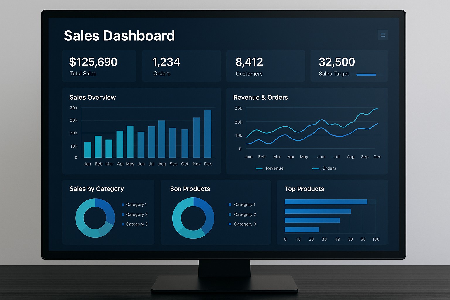
Sales dashboards are centralized, visual representations of an organization’s sales activity, outcomes, and trends. They condense data from multiple systems into a concise view that supports decision-making, forecasting, and accountability. At their best, dashboards provide real-time visibility into the health of the sales pipeline, highlight deviations from targets, and reveal opportunities for acceleration. They are not mere fancy graphs; they are analytic instruments designed to align sales behaviors with strategic objectives.
Effective dashboards translate complex data into intuitive signals that stakeholders can act on quickly. They serve a spectrum of audiences—from frontline sales reps who need guidance on next-best actions to sales managers and executives who require insight into territory performance, compensation implications, and forecast confidence. A well-constructed dashboard minimizes the cognitive load on users by presenting the most relevant measures, enabling faster interpretation and more consistent decision-making across the team.
In practice, dashboards support visibility into both current performance and future outcomes. They enable trend analysis, cohort comparisons, and scenario planning. By coupling data from CRM, marketing automation, finance, and operations, dashboards create a cohesive narrative about how opportunities move from lead to close, how wins convert at different price bands, and how seasonality or market conditions shape the forecast. The ultimate objective is to empower teams to act with clarity and precision, turning data into measurable improvements in win rates, revenue, and customer value.
Key Metrics to Track in Sales Dashboards
Choosing the right metrics is essential to avoid information overload and to ensure that the dashboard answers the most important business questions. Metrics should reflect the stages of the sales process, the quality of opportunities, and the efficiency of the team. They ought to be actionable, benchmarked, and tied to both short-term targets and long-term strategy. When metrics are aligned with business outcomes, the dashboard becomes a proactive management tool rather than a passive report.
In addition to surface-level indicators, it is valuable to measure the health of the sales pipeline, the effectiveness of close plans, and the accuracy of forecasts. Consider pairing leading indicators (such as engagement activity and early-stage opportunity velocity) with lagging indicators (such as actual revenue and quota attainment) to create a balanced view that supports both tactical execution and strategic planning.
- Total Pipeline Value: the sum of all active opportunities, typically by stage, to gauge potential revenue and momentum.
- Revenue and Annual Recurring Revenue (ARR): current period revenue and ongoing contractual commitments to forecast future cash flow.
- Conversion Rates: the percentage of leads that become opportunities and the percentage of opportunities that close, including separate visibility for win rates by cohort or product line.
- Average Deal Size: the mean revenue per closed deal, useful for understanding mix shifts and pricing effectiveness.
- Sales Cycle Length: average duration from initial contact to close, highlighting bottlenecks and seasonal effects.
- Forecast Accuracy: the closeness of the forecast to actual results, indicating reliability of planning and measurement discipline.
- Quota Attainment: percentage of reps or teams hitting or exceeding targets, useful for assessing territory design and coaching needs.
- Activity Metrics: counts of calls, emails, meetings, and demos associated with opportunities, to link activity with outcomes and to optimize effort allocation.
Building Effective Dashboards: Design Considerations
Designing for clarity requires understanding the daily work rhythms of the intended audience. A dashboard should present the right information at the right level of detail, with visual elements that support quick interpretation, not cognitive overhead. Prioritize a clean layout, consistent terminology, and focused storytelling that aligns with the questions stakeholders are seeking to answer—such as “Where is my pipeline at risk?” or “Which deals are most likely to close this quarter?”
Interactivity is valuable when used judiciously. Features like filter controls by time period, region, product line, or rep can help users slice data to their specific context without creating information overload. Equally important is data freshness: establish a realistic refresh cadence that matches decision cycles, and clearly communicate the timestamp of the last update so users know when to trust the numbers. Thoughtful design also means avoiding sensational colors or misleading visualizations that could distort interpretation.
- Visual clarity: select charts that communicate the intended message with minimal ambiguity, avoiding overly complex visuals.
- Consistent color schemes: map colors to a defined meaning (e.g., green for on-target, red for at-risk) and apply it across sections for quick scanning.
- Avoid clutter: limit the number of visuals per screen and group related metrics to reduce noise and improve focus.
- Drill-down capability: enable users to click into a metric to view underlying data and context, supporting root-cause analysis.
- Benchmarks and targets: display clear targets, tolerances, and historical baselines to foster comparison and accountability.
- Exportability and shareability: provide options to export reports and to share dashboards with stakeholders who need them outside the core platform.
Data Quality and Governance for Sales Dashboards
The reliability of a sales dashboard hinges on data quality and governance. Dashboards pull data from multiple sources such as CRM systems, financial systems, marketing platforms, and ERP tools. Establishing a robust data model, clear definitions, and consistent measurement rules is essential so that every stakeholder operates on a single version of the truth. It is important to document definitions for key metrics (for example, what constitutes a “closed-won” deal or a “qualified lead”) and to maintain lineage so users can understand how data flows from source to visualization.
Data freshness, accuracy, and completeness should be monitored as part of ongoing governance. Decide on real-time versus batch updates based on decision needs and system capabilities. Implement validation checks to catch anomalies (such as negative pipeline values or improbable win rates) and establish escalation processes when data quality issues arise. Governance also encompasses access controls and privacy considerations, ensuring that sensitive sales data is visible only to appropriate roles while enabling collaboration where appropriate.
Operational practices, such as standardized metric definitions, data dictionaries, and documented data sources, help sustain dashboard usefulness across organizational changes. Regular reviews with stakeholders—sales leaders, territory managers, and analysts—can identify changing business questions and refine the dashboard accordingly. The goal is to maintain trust in the dashboard as a primary source of truth that supports disciplined decision-making rather than a moving target that undermines credibility.
Implementation Roadmap and Best Practices
Launching an effective sales dashboard typically benefits from a structured roadmap that emphasizes alignment, iteration, and adoption. Begin with alignment on the business questions the dashboard should answer and the metrics required to measure progress toward targets. Next, map data sources and define a unified data model, including metric definitions, time granularity, and scope. Once the foundation is in place, prototype a minimal viable dashboard focused on critical workflows, gather feedback from a representative set of users, and iterate based on real usage patterns.
Adoption hinges on governance, training, and ongoing stakeholder engagement. Provide role-based views that match the needs of reps, managers, and executives, and offer training that demonstrates how to interpret metrics, navigate filters, and act on insights. Establish a cadence for reviews—weekly for tactical monitoring and monthly for strategic assessment—and pair dashboards with lightweight playbooks that prescribe recommended actions for common scenarios such as pipeline slippage or forecast variance. Over time, expand the dashboard to support additional use cases, such as territory planning, sales capacity planning, and channel partner performance, while preserving core clarity and reliability.
Use Cases across Industries and Scales
Sales dashboards adapt to a range of business contexts, from startups with rapid growth to large enterprises with complex product lines and geographies. In B2B environments, dashboards frequently emphasize pipeline health, deal velocity, and multi-step close plans, supporting sellers and managers as they navigate longer sales cycles. In B2C contexts, dashboards may focus on high-volume transactions, conversion funnels, and regional demand patterns, complemented by marketing-driven metrics such as cost per acquisition and campaign attribution. Across industries, dashboards help forecast revenue across scenarios, identify cross-sell and upsell opportunities, and support quota design and territory optimization.
Beyond sector differences, dashboards scale with organizational maturity. Early-stage teams may rely on simple visuals and a handful of metrics, while mature organizations incorporate advanced analytics, scenario modeling, and automated anomaly detection. Regardless of scale, the core objective remains the same: provide timely, credible information that informs actions, aligns teams around common objectives, and fosters accountability for outcomes.
Practical Adoption and Operational Considerations
To maximize value, embed dashboards in the daily workflow. Integrate them into reporting rituals, CRM dashboards, and executive review sessions so that insights are consistently surfaced where decisions are made. Consider setting up alerting for critical thresholds—such as when forecast accuracy dips below an agreed level or when a high-value opportunity stalls—to prompt timely intervention. It is also important to balance standardization with flexibility, offering standard templates while allowing teams to customize views for their specific contexts, as long as they adhere to core definitions and governance rules.
How should I define metrics for my sales dashboard?
Define metrics with clear, documented definitions, data sources, and update cadence. Engage cross-functional stakeholders to ensure alignment on what each metric measures, how it should be calculated, and what constitutes a meaningful threshold or target. Maintain a single source of truth for each metric to prevent drift across dashboards and ensure consistency in reporting.
How often should dashboards be refreshed and who should access them?
Refresh frequency depends on decision cadence and data availability. Core dashboards that drive operational decisions might refresh in near real-time or daily, while strategic dashboards may update weekly. Access should be role-based, with reps seeing individual and team-level views, managers seeing team performance and forecast implications, and executives having a high-level, outcome-focused view. Ensure privacy and security considerations are addressed in line with organizational policies.
What are common pitfalls to avoid in sales dashboards?
Avoid overloading dashboards with too many metrics or overly complex visuals that obscure the main message. Ensure data quality and consistent definitions to prevent contradictory signals. Be mindful of misaligned targets or outdated baselines that can mislead decisions. Finally, avoid rigid dashboards that cannot adapt to evolving business questions; plan for iterative improvements without sacrificing core clarity and governance.
How can dashboards support forecast accuracy?
Dashboards support forecast accuracy by aggregating historical results, current pipeline health, and attrition or acceleration signals. Visualize forecast bands, confidence levels, and scenario analyses to illustrate potential outcomes under different conditions. Regularly review variance between forecast and actuals, investigate root causes, and adjust pipeline stages, conversion rates, or activity expectations accordingly to tighten future forecasts.
