Now Reading: Types of Data Visualizations: Charts and Graphs Explained
-
01
Types of Data Visualizations: Charts and Graphs Explained
Types of Data Visualizations: Charts and Graphs Explained
Overview: Aligning Visualizations with Business Goals
Data visualizations serve as decision support tools, translating complex information into accessible visuals that guide actions, not merely decorate reports. In business contexts, the most effective visualizations align with specific questions: what happened, why it happened, and what is likely to happen next. The goal is to present data in a way that reduces cognitive load, highlights meaningful differences, and preserves accuracy. Visual design decisions should be driven by the audience, the data characteristics, and the decision-making process supported by the visualization.
Before choosing a chart type, start with clarity and integrity. Consider the primary message, the intended audience, and the level of precision required. A chart that looks impressive but obscures the underlying data can mislead stakeholders. Conversely, a clear, well-labeled visualization can accelerate consensus and actions. In practice, this means balancing emphasis, scales, and context, while avoiding unnecessary embellishments and misleading visual tricks.
To ensure consistency across dashboards and reports, establish a simple decision framework: identify the data question, match it to a visualization purpose, validate the chart with a sample of the audience, and iterate on labeling and annotations. In the following sections we examine common visualization types, their typical use cases, and practical guidelines for business applications.
Bar and Column Charts: Comparing Categories at a Glance
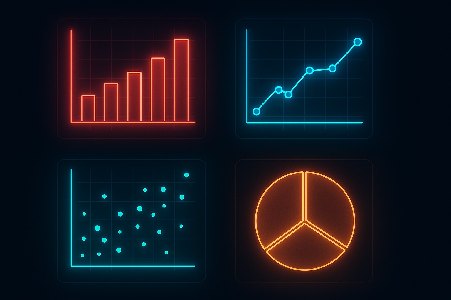
Bar charts and column charts are among the most durable tools for category comparison. They excel when you want to show differences across discrete groups, such as product lines, regions, or customer segments. When data is ordered meaningfully, stacked or grouped variants can reveal composition and hierarchy. For large sets of categories, horizontal bars often improve readability, while vertical bars are traditional for time-series-like category lists that benefit from compact presentation.
In practice, bar charts are most effective when the category labels are concise and the number of categories is moderate. They sacrifice a bit of precision for a quick, intuitive sense of magnitude, which is valuable in executive summaries and high-level dashboards. When the dataset grows too large, consider alternative visuals or interactive filtering to maintain clarity. The examples below illustrate typical uses and pitfalls:
- Use bar charts to compare absolute values across categories (e.g., quarterly sales by region).
- Prefer horizontal bars when category labels are long or when comparing many categories.
- Avoid stacked bars if the comparison of individual parts is central; consider a grouped bar chart or a line chart for trend analysis.
- Limit the number of categories to preserve readability; consider aggregating or filtering for focus.
- Label axes clearly, include units, and provide a concise caption that highlights the key takeaway.
Line Charts and Time Series: Tracking Trends Over Time
Line charts are the workhorse of time-oriented data. They reveal momentum, seasonality, and turning points with a smooth trajectory that is easy to scan. When multiple series are involved, lines can be stacked or overlaid to compare trajectories, while area charts emphasize cumulative movement. The interpretation of line charts hinges on consistent time intervals, proper scaling, and unambiguous legends.
Despite their simplicity, line charts require careful handling of data frequency and missing values. Irregular time intervals or gaps can distort trend perception, and dual-axis line charts risk creating false equivalences if scales are not aligned. When presenting forecasts or scenario analysis, juxtapose actual data with projections to preserve context. Consider these practical pointers:
| Aspect | Line Chart | Area Chart |
|---|---|---|
| Best for | Trends over time | Trends with magnitude emphasis |
| Multiple series | Clear with distinct colors | Better for cumulative comparisons |
| Data density | Moderate to low frequencies | Higher density can obscure lines |
When presenting time-based data to executives, keep the legend concise, ensure the time axis is labeled with meaningful units, and avoid clutter by limiting the number of series shown simultaneously. If trends are subtle, annotate key inflection points to guide interpretation without overwhelming the viewer.
Pie and Donut Charts: Proportions and Proportional Context
Pie charts and their donut equivalents aim to show how a whole is divided among parts. They can be effective for illustrating composition when there are a few categories with clear, mutually exclusive contributions. However, they are not well-suited for precise comparisons across many segments, especially when differences are small. In business contexts, use them sparingly and always provide a reference baseline or a target to anchor interpretation.
To maximize clarity, ensure that slices have distinct colors, with high contrast and accessible labeling. When the category count exceeds a manageable handful, consider alternative visuals such as a horizontal bar chart that ranks components by magnitude. The following guidance helps avoid common missteps:
- Use pie charts only when the sum of parts is meaningful and the viewer’s task is to assess relative contributions, not exact percentages.
- Limit the number of slices to 5–7; more than that reduces readability and can mislead by overemphasizing small differences.
- Label percentages or provide a legend; ensure that the total sum is explicit or implied.
- Be cautious with stacking or 3D effects, which can distort perception and reduce accuracy.
- Provide a short interpretation in the caption to guide the reader toward the desired takeaway.
Scatter Plots and Relationships: Exploring Correlation and Structure
Scatter plots visualize the relationship between two variables, revealing correlation, clustering, outliers, and potential non-linear patterns. They are especially useful for data discovery, hypothesis testing, and identifying anomalies that require deeper investigation. When adding a third or fourth dimension, consider color, size, or facet panels to preserve readability without sacrificing interpretability.
Interpreting scatter plots requires awareness of sample size, measurement scale, and potential confounders. They can suggest, but not confirm, causation, and overplotting can obscure patterns. For datasets with many points, techniques such as transparency, binning, or small multiples help maintain visibility of structure. Practice these guidelines to optimize scatter visuals:
- Display a linear or non-linear fit line to summarize the overall relationship when appropriate.
- Use color or shape to distinguish subgroups, but avoid excessive encoding that confuses interpretation.
- Scale axes consistently and include reference lines (e.g., zero or target values) to provide context.
- Group similar observations with jitter or transparency to reduce overplotting in dense regions.
- Reserve scatter plots for exploratory analysis or targeted inquiries, not as the primary dashboard view for all audiences.
Histograms, Distributions, and Density Plots
Histograms and density plots illuminate the distribution of a single variable, revealing skewness, modality, and tail behavior. They are essential for understanding data quality, selecting modeling approaches, and setting parameter ranges for simulations or forecasts. Density plots, in particular, offer smooth representations that can highlight subtle differences between distributions. When presenting histograms, choose an appropriate bin width and consider overlaying a theoretical distribution for comparison.
In practice, these visuals support decisions about data preparation, outlier handling, and segmentation strategies. For audience clarity, accompany histograms with percentile marks or annotated summary statistics, and ensure the axis scales reflect the range of interest without distorting the perceived spread. Below is a concise code example showing how a common histogram can be generated for a typical business dataset:
import numpy as np
import matplotlib.pyplot as plt

data = np.random.normal(loc=0, scale=1, size=1000)
plt.hist(data, bins=20, color="#4c8bf5", edgecolor="white")
plt.title("Distribution of Value X")
plt.xlabel("Value X")
plt.ylabel("Frequency")
plt.show()
Heatmaps, Choropleths, and Matrix Visuals
Heatmaps and choropleth maps encode data intensity through color, enabling quick pattern recognition across matrices or geographic regions. They are powerful for showing spatial or relational structures, such as correlations between metrics across departments, regional performance, or risk exposure. The choice of color scale matters greatly; perceptually uniform palettes improve accuracy, while colorblind-friendly combinations reduce accessibility barriers. When used with care, heatmaps can reveal clusters, gaps, and gradients that might be missed in tabular or line-based presentations.
To maximize effectiveness, pair heatmaps with a clear legend, explicit axis labels, and a concise narrative explaining the observed patterns. For geographically grounded visuals, ensure that the map projection is appropriate for the region and that the data are normalized to allow fair comparisons. A few practical considerations:
Tip: Prefer sequential color scales for continuous data and avoid divergent scales unless you need to emphasize deviations from a baseline.
Specialized Visualizations for Dashboards
Dashboards often require compact, interactive visuals that summarize status, performance, and risk at a glance. In these contexts, consider a mix of sparklines for trend context, small multiples for category comparisons, and indicator widgets that highlight targets or thresholds. Interactivity—such as tooltips, drill-down filters, and dynamic date ranges—can greatly enhance insight, provided it remains discoverable and does not overwhelm the user with options.
Design for your audience’s workflow: executives may prefer high-level summaries with the ability to explore underlying data on demand, while analysts require access to raw figures and the ability to run what-if scenarios. Ensure consistent color coding, predictable interactions, and accessible labeling across all dashboard components to support efficient decision-making.
Best Practices for Clarity, Accessibility, and Storytelling
Across all visualization types, clarity and accessibility trump ornamentation. Use descriptive titles and captions, label axes with units, and avoid truncating numbers or stacking multiple dissimilar scales. Favor solid, high-contrast colors and provide alternative text or data labels where possible to support screen readers. Think in terms of storytelling: the visualization should lead the viewer through a logical narrative, with context, takeaway, and next steps clearly anchored in the data.
Operational considerations include consistency in formatting, version control of charts, and documentation of data sources and transformations. In business settings, visuals should be reproducible and auditable, enabling colleagues to verify figures and replicate analyses. When standardizing a visualization language, document rules for color palettes, typography, and default chart types to maintain coherence across reports and platforms.
FAQ
What visualization should I use for time-series data?
For time-series data, line charts are typically the go-to choice because they emphasize changes over time and facilitate quick trend assessment. Use line charts when you want to compare multiple series with aligned time axes, and consider area charts if you need to convey cumulative magnitude. If the goal is to highlight distribution or bursts within the timeline, overlaying annotations or using sparklines can provide additional context without clutter.
How many categories is too many for a bar chart?
There is no fixed threshold, but readability generally declines as the number of categories grows beyond 10–15, especially with long labels. For larger category sets, consider simplifying the data by aggregating minor categories, using a horizontal bar chart with interactive filters, or splitting the data into multiple panels. If the goal is ranking rather than precise magnitudes, a sorted bar chart with clear labeling can still be effective for a broad audience.
When is a pie chart appropriate?
Pie charts are most appropriate when you want to show parts of a whole with a small number of categories and when precise proportions are central to the message. They are less effective for comparing small differences between similar slices or when there are many categories. If precision or comparison is critical, a horizontal bar chart or a stacked bar chart often communicates the information more clearly.
What are the trade-offs of using a scatter plot?
Scatter plots excel at revealing relationships, clusters, and outliers, but they require careful design to avoid misinterpretation. With large or dense datasets, overplotting can obscure patterns, so techniques such as transparency, sampling, or facetting are helpful. Interpretations should be cautious about causation; scatter plots indicate correlation and structure, not definitive cause-and-effect relationships. When adding a third variable, color or size can convey information, but avoid overloading the visual.
