Now Reading: Charts vs Tables: When to Use Each for Data Presentation
-
01
Charts vs Tables: When to Use Each for Data Presentation


Overview
In professional communications, the choice between charts and tables shapes how audiences perceive data and what conclusions they draw. Charts excel at revealing patterns, trends, and relationships across variables, delivering a quick, visual interpretation that supports strategic thinking. Tables, by contrast, preserve exact values, enable precise comparisons, and offer a reliable reference for readers who need to verify numbers or extract data for further analysis. The key is to align the format with the story you want to tell and the needs of your audience.
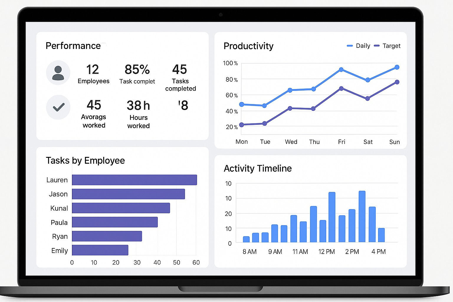
In business contexts, data is rarely presented in a vacuum. Analysts chase insights, managers seek clarity for decision-making, and stakeholders require both accuracy and readability. A chart might tell the story of a revenue trend over the last four quarters, while a table could provide the precise quarterly figures, growth rates, and margins that executives may cite in a board packet. Understanding the strengths and limits of each format helps you craft communication that is both compelling and trustworthy.
When to Use Charts
Charts are particularly effective when your primary objective is to convey patterns, trends, or relationships at a glance. They compress complex data into a visual narrative that can be scanned quickly, making them ideal for executive summaries, dashboards, and presentations where time and cognitive load matter.
- Communicating trends over time or across categories in a compact visual.
- Comparing proportions, shares, or relative magnitudes among several groups.
- Showing distribution, frequency, or density of a variable when the shape or spread matters.
- Highlighting relationships or correlations between two or more variables.
- Identifying outliers, anomalies, or sudden shifts that warrant deeper investigation.
When used thoughtfully, a chart surfaces the story behind the data—where you should focus, how performance evolved, and what correlations deserve attention. However, charts can mislead if encoded poorly, scaled in misleading ways, or overloaded with information. The goal is to balance simplicity with fidelity, so readers gain insight without being distracted by decorative elements or ambiguous axes.
When to Use Tables
Tables shine when readers require exact numbers, need to compare values precisely, or intend to perform their own calculations or data slicing. They are also the most straightforward way to present regulatory, financial, or audit-related data where accuracy and traceability are paramount. Use tables when the data size is manageable and readers benefit from direct access to each value.
- Providing precise values for numerical comparison or record-keeping.
- Enabling readers to copy, paste, or reuse data in their own analyses or reporting.
- Handling datasets with many categories or subgroups where a chart would be too dense or noisy.
- Maintaining clarity when numerical precision is essential for decision-making or compliance.
Tables support reproducibility and accountability, but they can overwhelm readers if the dataset is large or if the relationships between numbers are not obvious from the tabular structure alone. Clear headings, consistent formatting, and thoughtful organization are crucial to keep a table usable rather than cluttered.
Choosing the Right Visual for the Narrative
The decision to use a chart or a table should rest on the intended narrative and the audience’s needs. Start by asking what you want the reader to take away after a quick glance, and then determine whether a visual encoding or a precise numeric reference will best support that takeaway. If the objective is to signal a trend, pattern, or comparison across categories, a chart is usually the better fit. If the aim is to enable exact replication or detailed inspection, a table might be the more responsible choice.
Another practical guideline is to test the data against the question you’re answering. If a chart’s insights vanish once the audience focuses on a few outliers, consider re-scoping the data or supplementing the chart with a small, carefully chosen table. Conversely, if a chart fails to convey the actual numbers needed for compliance or verification, add a compact table to accompany it. The most effective data presentations often blend both formats in a complementary way, with charts telling the story and tables offering the data you can trust and verify.
Design Considerations for Effective Data Presentation
Regardless of format, the design quality of your visuals determines how accurately readers interpret the data. Good design emphasizes clarity, consistency, and perceptual effectiveness. Use consistent scales and units, label axes clearly, and avoid nonessential decorations that compete with the data. When presenting multiple series, ensure color or saturation differences reflect perceptual differences rather than nominal distinctions; this improves readability and reduces cognitive load.
Keep data density in check. For charts, avoid overplotting and choose chart types that minimize misinterpretation. For tables, prioritize a logical order (by value, category, or time), use alignment that supports quick scanning, and highlight the most important figures through typography or spacing rather than color alone. Also be mindful of accessibility: ensure adequate contrast, provide text alternatives for charts, and include accessible descriptions so readers using assistive technologies can understand the visuals.
Accessibility and Perception
Accessible data presentation benefits all readers, including those with color vision differences or screen readers. When charts rely solely on color to distinguish categories, readers with color blindness may miss key distinctions; pair color coding with distinct shapes, patterns, or labels. For tables, provide clear header rows, consistent alignment, and concise captioning that explains the data context and units of measure. Always offer textual descriptions or alt text for charts and consider providing a data appendix or downloadable CSV for readers who need to work with the numbers directly.
Perception can also be influenced by framing, scales, and the order in which information is presented. Avoid truncating axes, using misleading aspect ratios, or cherry-picking data that exaggerates a message. When readers trust the integrity of the presentation, they are more likely to engage with the insights and act on them responsibly.
Practical Implementation in Dashboards, Reports, and Presentations
In dashboards, charts tend to be the workhorse for monitoring status, forecasting, and identifying hot spots at a glance. They enable interactive exploration through filters and drill-downs, helping users uncover insights without wading through numbers. In formal reports, especially those that require auditability or precise references, tables provide the backbone of the data core, with charts used to illustrate the narrative succinctly. In live presentations, a balanced mix of a few well-chosen charts complemented by key table figures often yields the most engaging and credible delivery.
When combining formats, maintain a clear rhythm: introduce the main chart to convey the story, then provide a table that reinforces or verifies the quantitative details. Keep a consistent visual language across sections—same color mappings for the same categories, uniform axis labeling, and coherent font choices. If space is limited, favor a chart with a concise legend over a dense table, and place essential numbers in a small, easy-to-scan table for reference rather than an exhaustive dataset.
Common Pitfalls and How to Avoid Them
Overloading a single chart with too many series, categories, or nonessential features is a common pitfall that diminishes clarity. Always test whether the visual remains interpretable if a single element is removed. Misleading scales, axis truncation, and inconsistent tick marks can distort the message, so ensure axis ranges are appropriate and consistently applied across related visuals. Mixing chart types or juxtaposing a chart with a dense table without a clear narrative can confuse readers; strive for a single, cohesive story per page or slide and use additional formats only to reinforce key points. Finally, neglecting data provenance, limitations, or the source context can undermine credibility, so include source notes and any caveats that readers should consider when interpreting the values.
Examples in Practice
“A chart should reveal the pattern first; the table should confirm the numbers behind the pattern.”
Consider a quarterly sales dashboard for a regional team. A line chart shows the upward trend in overall revenue, with subtle annotations highlighting seasonal dips. A compact table beneath provides the exact quarterly figures, growth rates, and margin percentages for those who need precise numbers for budgeting or variance analysis. The combination communicates the trajectory at a glance while preserving the data for verification and deeper analysis by stakeholders who request specific figures. In a regulatory report, you might replace the chart with a small set of well-labeled figures and a separate, clearly organized data appendix to satisfy audit requirements while still presenting the key narrative succinctly.
Final Checklist for Data Presentations
- Is the data story clear and aligned with the audience’s decisions?
- Are the visual encodings (color, shape, size) chosen for perceptual effectiveness rather than decoration?
- Is there an appropriate balance between charts and tables, with each serving a distinct purpose?
- Are axis labels, units, and data sources clearly stated to support verification and interpretation?
FAQ: How do I decide between a chart and a table for trend data?
For trend data, start with a chart to reveal the direction and pace of change at a glance. If stakeholders require exact values or you must support precise quarterly comparisons in detail, supplement the chart with a concise table that lists the numbers and key metrics. The combination ensures both quick comprehension and rigorous reference.
FAQ: Are there cases where a chart can replace a table while preserving precision?
Yes, when the goal is to communicate the general trajectory or pattern and the exact minutiae are not required for the reader’s immediate decision, a well-designed chart can replace a table. In such cases, include a brief note or an optional data appendix with precise figures for those who need them, but avoid forcing readers to extract exact values from a visual that was not intended to be precise.
FAQ: How can I balance chart and table on a single page to satisfy both readers?
Structure the page so that the chart occupies the primary visual area and the table sits in a clearly labeled secondary space. Use consistent labels and shared color coding so readers recognize the relationship between the two. Provide a short narrative or caption that explains what the chart shows and what the table adds in terms of exact values for reference and verification.
FAQ: What role do interactivity and filtering play in deciding between chart and table?
Interactivity can elevate charts by enabling readers to drill down into specific time periods or categories, which may reduce the need for a dense table. However, if readers require offline analysis or archival records, a static table or a downloadable data file complements the interactive experience. The best approach often combines interactive charts for exploration with a downloadable data table for precise analysis and reproducibility.


")