Now Reading: How to Choose the Right Chart Type for Your Data
-
01
How to Choose the Right Chart Type for Your Data
How to Choose the Right Chart Type for Your Data
Why the right chart type matters for business communication
In any data-driven decision process, the visualization you choose acts as a bridge between data and insight. The right chart type highlights the critical signal in your dataset, makes the narrative visible, and reduces room for ambiguity. When charts align with the message you intend to convey, stakeholders can quickly grasp trends, patterns, and outliers without second-guessing the underlying data. Conversely, a poorly chosen chart can distort the message, obscure important contrasts, or mislead readers about the scale or relationship of variables. This is not about aesthetics alone; it is about accuracy, efficiency, and trust in the data story you present.
The best chart choice emerges from a disciplined approach to your audience, the question you are answering, and the data you have. Start with the decision context: who will read the chart, what decision will be made, and what action should follow. Then consider the data type, whether you are summarizing a distribution, comparing categories, revealing a time trend, or exploring a relationship between variables. Finally, anticipate potential misinterpretations and design the visualization to minimize them: choose clear scales, avoid misleading axis manipulations, and add contextual annotations. When these elements align, your chart becomes a potent instrument for strategic communication rather than a mere decorative element on a slide or report.
Common chart types and when to use them
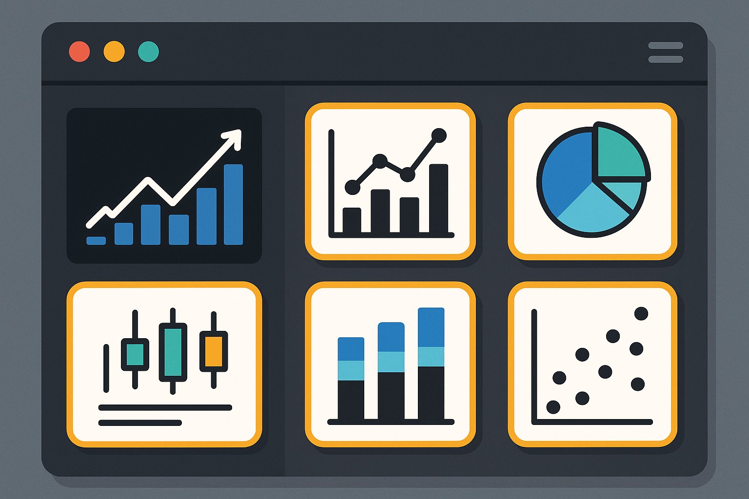
Understanding the core chart types helps you map data characteristics to the visualization that most clearly communicates the intended message. Below is a concise guide to widely used charts and the scenarios where they typically excel. Use this as a quick reference when you are weighing options in a live workflow or a dashboard review.
- Bar chart — ideal for comparing values across discrete categories or groups. Use horizontal bars when category names are long or there are many categories, and remember to order bars meaningfully (e.g., from largest to smallest) to emphasize the key ranking.
- Line chart — best for displaying trends over time or continuous sequences. Line charts are particularly effective when you want to reveal trajectory, seasonality, or interruptions, and they shine when there are multiple series for comparison with consistent time intervals.
- Scatter plot — designed to reveal relationships between two numeric variables. This type is powerful for identifying correlation, clustering, and outliers, as well as for spotting linear versus non-linear patterns that warrant deeper analysis.
- Pie chart — conveys a part-to-whole relationship for a small number of categories. Exercise caution: pie charts are most effective when you compare a few slices with clearly distinct proportions, and they often underperform relative to simple bar charts for larger category sets.
- Histogram — shows the distribution of a single numeric variable. Histograms help you understand data shape, central tendency, variability, and the presence of skew or multimodality, which informs subsequent modeling or decision steps.
- Heatmap — exposes patterns across two categorical or binned dimensions, with color intensity representing magnitude. Use heatmaps to reveal density, frequency, or intensity across a matrix, especially when you need to surface interactions between factors.
In practice, every chart choice carries trade-offs. A line chart can mask abrupt shifts if you aggregate data too aggressively, while a stacked bar chart might complicate comparisons across categories if the segment order is not carefully considered. As you evaluate options, prioritize clarity, avoid unnecessary embellishment, and ensure the visual emphasizes the key takeaway rather than vanity metrics. When your chart type mirrors the structure of the data and the decision at hand, you’re more likely to generate accurate interpretation, faster stakeholder alignment, and stronger actionability.
A practical decision framework for chart selection
A disciplined framework helps teams converge on an appropriate visualization quickly, even in fast-paced environments. Start with a clear articulation of the question and the audience, then translate data properties into chart-type candidates, and finally validate through quick stakeholder checks. The goal is to narrow options to one or two strong contenders rather than default to familiar but potentially misleading visuals.
Paragraph 1: The framework begins with formulating the question in business-relevant terms and identifying the intended decision or action. Are you monitoring performance against a target, exploring relationships between variables, or communicating a distribution to assess risk? Who will consume the chart—executives focused on summary conclusions, analysts who will perform deeper dives, or cross-functional teams that require quick takeaways? Clarifying these inputs helps you avoid chart selection that satisfies internal preferences but fails to move decisions forward.
Paragraph 2: Next, diagnose the data. Determine whether you are dealing with categorical, numerical, time-series, or proportion data; understand the number of categories; and assess whether you need to emphasize comparisons, trends, distributions, or relationships. Then generate 2–3 candidate chart types and quickly compare how well each candidate supports the narrative. If possible, validate with a stakeholder or run a quick, low-stakes pilot on a small group before scaling to a broader audience. This iterative validation reduces rework, preserves credibility, and ensures the chosen visualization aligns with the decision context.
- Define the question and audience with precision.
- Identify data type and the primary relationship to highlight (comparison, trend, distribution, or relationship).
- List 2–3 chart-type candidates that could effectively tell the story.
- Evaluate each candidate for clarity, potential misinterpretation, and accessibility considerations (color, labels, scale).
- Prototype and test with stakeholders, incorporating feedback quickly.
- Finalize the chart with clear annotations, appropriate scales, and concise labeling.
Paragraph 3: This framework supports consistent, scalable chart decisions across teams and products. When you critique a candidate chart, focus on one primary takeaway, ensure the axis scales are honest, and provide just enough annotation to anchor interpretation without crowding the visual. Documenting these decisions in a brief data visualization guide for your team can further improve consistency and reduce back-and-forth in future dashboards or reports.
Data characteristics and visualization guidelines
Linking data characteristics to chart choices reduces guesswork and helps non-specialists interpret visuals correctly. By categorizing data types upfront, you can quickly converge on a map of appropriate visualization options and common pitfalls to avoid. This section outlines typical data situations and recommended visualization alignments, along with quick cautions to keep in mind.
Paragraph 1: When data are categorical (nominal or ordinal) with a small number of distinct groups, bar charts usually deliver the most straightforward comparisons. If you need to show how a single category is distributed across a second dimension, a grouped or clustered bar chart may be appropriate, provided the groups remain legible and labeled clearly. For ordinal data, maintain consistent ordering to preserve the intended sequence and avoid implying a false ranking.
Paragraph 2: For time-series data, line charts are typically the preferred choice because they emphasize continuity and temporal changes. If you must compare multiple time series, ensure that series lines are distinctly colored and styled, and consider a small multiples approach when the number of series is high. When the focus is on the distribution of values across time, consider histograms or density plots for exploratory analysis while keeping the time axis intact for interpretability.
- Categorical data: use bar charts for direct category comparisons; avoid stacked bars when there are many categories, which can reduce readability.
- Time-series data: prefer line charts to reveal trends; use small multiples or interactive controls when comparing several series.
- Proportions and part-to-whole: pie charts can be acceptable for a handful of categories with clear differences, but bar charts or horizontal bar charts often provide better readability.
- Distributions: histograms or kernel density plots are generally more informative than box plots for distribution shape as a primary message.
- Relationships: scatter plots excel for exploring correlations and potential causality signals when accompanied by regression lines or confidence bands if appropriate.
Paragraph 3: Color, labeling, and accessibility play crucial roles across all chart types. Use color with intention (e.g., to differentiate categories or highlight a key series) and maintain high contrast for legibility. Include axis labels, units, and a succinct title that conveys the primary message. For accessibility, provide text equivalents where possible, ensure keyboard navigability for interactive charts, and avoid relying solely on color to convey critical information. In all cases, keep the chart proportionate to the surrounding content and avoid squeezing too much information into a single frame.
Examples by data scenario
In practice, matching data scenarios to charts is often a dynamic exercise. The following table provides concrete pairings of common data situations with recommended visualizations and the rationale for each choice. Use this as a practical reference during analyses, presentations, or dashboard design sessions.
| Scenario | Recommended Chart | Rationale |
|---|---|---|
| Sales by region for a single quarter | Column/bar chart | Clear, immediate comparison across regions; supports ranking and quick identifying top performers. |
| Revenue trend over 12 months | Line chart | Highlights trajectory, seasonality, and turning points over time with smooth continuity. |
| Customer satisfaction scores by service channel | Grouped bar chart or dot plot | Facilitates cross-channel comparison without implying a false order, preserving clarity. |
| Share of market by product category | Horizontal bar chart or stacked bar chart | Communicates proportion across several categories; stacked version shows cumulative share when space allows. |
| Distribution of response times | Histogram | Reveals distribution shape, skew, and the presence of outliers for operational insight. |
| Correlation between price and demand | Scatter plot with a trend line | Visually assesses relationship strength and potential patterns across the data range. |
Visual design considerations for clarity
Beyond choosing the right chart type, effective data visualization requires thoughtful design choices that reduce cognitive load and support interpretation. Clarity comes from consistent formatting, explicit labeling, and restraint in the use of embellishments that may distract from the data signal. Prioritize legible fonts, legible axis scales, and clear legend placement that does not obscure the data itself. When presenting to a mixed audience, favor simplicity and directness, and reserve advanced visual techniques for audiences with the requisite context and interest.
Balance is essential: avoid overcrowding a single chart with too many series, colors, or annotations. If a visualization attempts to convey multiple messages, consider splitting it into separate charts or using interactive controls to reveal details progressively. Consistent styling across charts in a report or dashboard also helps readers build familiarity and quickly locate the information they need. Finally, provide a succinct narrative or caption that frames the chart within the broader decision context, ensuring readers understand the intended takeaway.
FAQ
This section addresses common questions about chart selection and visualization practice. If your organization has unique data challenges, use these answers as a starting point and tailor them to your specific context and audience.
What is the best chart for comparing categories?
For straightforward category comparisons, bar charts (vertical or horizontal) are typically the most effective. They provide clear, immediate value comparisons and remain legible even when categories vary in length. Reserve more complex alternatives—like stacked bars or small multiples—when the goal is to show composition or multiple comparative dimensions, and ensure the category labels are concise and readable.
When should I avoid using a pie chart?
Pie charts should be avoided when there are many categories, when differences among slices are subtle, or when precise comparison is important. Bar charts usually offer better readability, especially as the number of categories increases. If you must show a part-to-whole relationship, consider a horizontal bar chart or a dedicated donut chart with a clear legend and highlighted slice to emphasize the primary portion.
How do I choose chart types for dashboards?
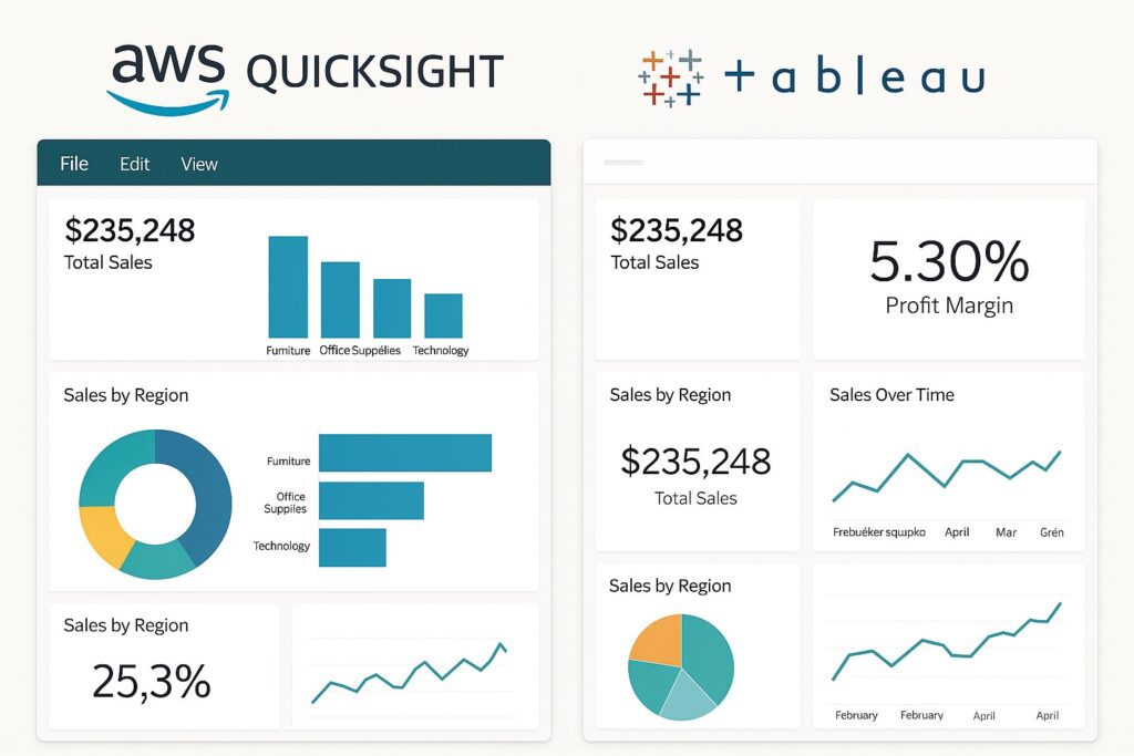
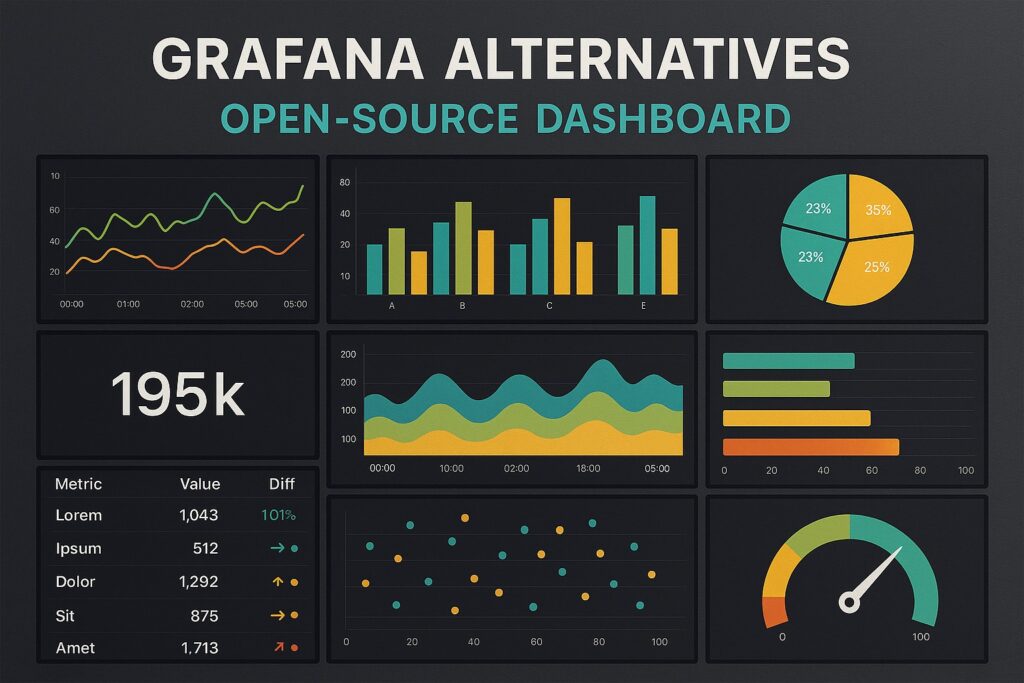
Dashboard design benefits from consistency and scannability. Choose a small set of core chart types that cover the majority of your data storytelling needs, and reuse them across widgets to reduce cognitive load. Prioritize charts that deliver a quick read on key metrics, consider interactivity for deeper exploration, and ensure each chart answers a distinct question aligned with user goals.
What role do color and labeling play in chart choice?
Color should enhance interpretation, not decorate. Use color to differentiate categories, highlight the focal area, or indicate thresholds, while maintaining accessibility with color-blind-friendly palettes. Labels matter for context; include axis titles, units, and concise captions that communicate the main insight. Avoid clutter by balancing label density with chart size and readability.
Should I always use a single chart per slide or page?
Not necessarily. A single, well-chosen chart can convey the central message effectively, but complex stories may require multiple charts to support a layered narrative. When using more than one chart, ensure each piece addresses a distinct question, avoid duplicating information, and structure the layout so readers can follow the logical progression from data to insight.
