Now Reading: KPI Dashboards: How to Effectively Track Key Performance Indicators
-
01
KPI Dashboards: How to Effectively Track Key Performance Indicators


Definition and value of KPI dashboards
KPI dashboards are compact, purpose-built interfaces that translate complex data into a concise, at-a-glance view of performance. They differ from static reports by emphasizing actionability, real-time context, and alignment with strategic objectives. A well-designed KPI dashboard helps executives, managers, and frontline operators focus on what matters most, surface exceptions early, and enable cross-functional decision-making without sifting through raw data. When designed with clear ownership and timely data, these dashboards become standard tools for daily management and strategic planning alike.
Beyond monitoring, dashboards become a conversation starter: they anchor quarterly reviews, drive accountability, and serve as a single source of truth for performance data across departments. When dashboards are organized around concrete targets and roles, they reduce ambiguity, shorten review cycles, and improve both the speed and quality of operational decisions. In fast-moving environments, a well-crafted KPI dashboard acts as a lightweight, continuously updated brief for leadership and teams alike.
Selecting the right KPIs
Selecting KPIs starts with business goals. Each KPI should be meaningful to the decision maker and linked to a business outcome. Apply SMART criteria, ensure data availability, and distinguish leading indicators from lagging ones. Avoid vanity metrics that look impressive but do not influence actions. Finally, ensure there is a clear owner and a defined update cadence so the KPI remains current and relevant.
To help categorize KPIs, consider these broad areas:
- Financial performance
- Customer health and satisfaction
- Operational efficiency
- Employee engagement and development
- Innovation and growth indicators
Designing KPI dashboards
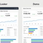
Effective KPI dashboard design begins with understanding your audience and the specific decision tasks the dashboard will support. Prioritize clarity over novelty, establish a visual hierarchy that guides the eye, and keep interactivity purposeful rather than distracting. In practice, this means aligning page layouts with user tasks, using consistent color and typography, and providing straightforward drill-down paths to the underlying data.
Five design principles to guide your work are listed below. They help ensure that dashboards are readable, actionable, and scalable as needs evolve:
- Explicit objective for each KPI page
- Consistent layout and visual hierarchy
- Appropriate visualization types for the data
- Minimized cognitive load and avoidance of chartjunk
- Meaningful context with targets and benchmarks
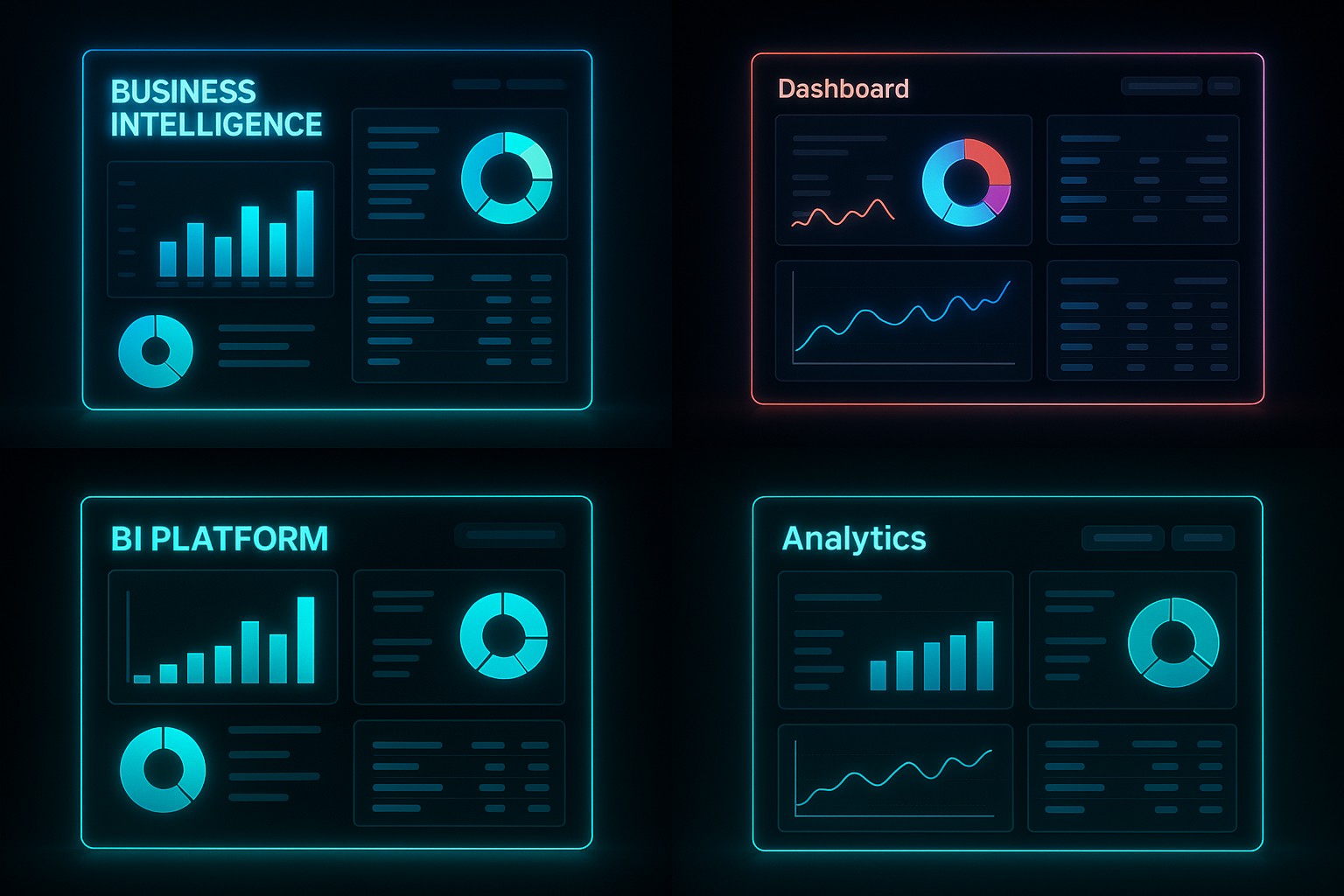
Visualizing KPIs effectively
Visualization choices should reflect the nature of the data and the speed at which decisions must be made. Use simple, scannable visuals and avoid chartjunk. For performance dashboards, sparklines or small multiples can illustrate trends; bullets or gauge-like visuals can show progress toward targets; heatmaps can reveal concentration of value or risk. Always test readability for color-blind users and ensure accessibility across devices.
In practice, pair context with metrics by including clear labels, axis scales, and concise annotations. Provide thresholds or target lines where appropriate, so viewers can instantly gauge whether performance is on track, below, or ahead of plan. Keep interaction purposeful—allowing users to drill into underlying data only when it adds value to the immediate decision they face.
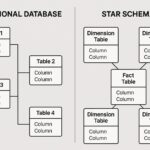
Data quality, reliability, and governance
Data quality is the backbone of trust in dashboards. Inconsistent definitions, missing values, and unreliable data sources erode credibility quickly. Start by documenting the data lineage, sources, and calculation logic for every KPI. Implement automated checks for completeness, range, and timeliness, and establish SLAs with data owners to ensure timely refreshes. Without reliable data, even the most elegant dashboard will fail to inform decisions.
Governance processes should formalize roles: data stewards, owners, and reviewers; version control; and an audit trail. A well-governed dashboard ecosystem uses data dictionaries, change logs, and regular reconciliations against source systems. This discipline helps teams understand how metrics are derived, when they were last updated, and who is responsible for corrections or improvements.
Implementation and adoption
Implementation requires more than a shiny UI. Begin with a pilot program to validate KPI definitions, data reliability, and user satisfaction before scaling. Provide clear training, establish champions in each department, and design the deployment to evolve with feedback. Track adoption metrics, such as login frequency and page depth, to measure cognitive uptake and value realization. A thoughtful rollout reduces resistance and accelerates the time to value from the dashboard investment.
To support a successful rollout, use a structured checklist that helps maintain focus during deployment. This ensures governance, data integrity, and user enablement remain priorities as you scale beyond the pilot.
- Stakeholder alignment and sponsorship
- Defined data sources and data owners
- Access controls, security, and governance
- Change management and training
Monitoring, iteration, and optimization
Ongoing monitoring and iteration are essential to keep dashboards relevant as the business evolves. Schedule regular reviews to assess KPI relevance, data quality, and user feedback. Treat the dashboard as a living tool: retire metrics that no longer drive decisions, adjust targets when strategy shifts, and introduce new KPIs as opportunities emerge. A disciplined feedback loop helps sustain alignment between the dashboard and the organization’s priorities.
By design, dashboards should support both steady-state monitoring and experimentation. Establish baselines for comparison, define alert thresholds, and ensure that the data refresh cadence matches the decision cadence. This balance enables proactive management without overwhelming users with noise or stale information.
FAQ
What is the difference between a KPI and a metric?
A KPI is a metric that is tied to a strategic objective and carries explicit targets and required actions. Not all metrics are KPIs; some measure activity or output without a direct link to strategic goals. The value of a KPI comes from its ability to drive decision-making and accountability.
How many KPIs should a dashboard track?
There is no one-size-fits-all number, but a practical range is typically five to fifteen KPIs per dashboard, depending on the audience and the decision-making context. Wider dashboards may segment by role or process, presenting a focused subset to each user while keeping a shared, higher-level view for governance purposes.
How do you set targets for KPIs?
Targets should be grounded in historical performance, strategic goals, and external benchmarks where available. Use a mix of baseline data, scenario analysis, and stretch goals while ensuring targets remain realistic and reviewable. Document the rationale for each target to aid transparency during performance conversations.
What visualization practices help readability?
Keep visuals simple and familiar, use consistent scales, and avoid overcrowding. Prefer standard chart types, provide clear labels, and ensure color usage supports meaning rather than decoration. Enable easy comparison by aligning axes and enabling users to skim essential information quickly.
How often should dashboards be refreshed?
Refresh cadence should align with data availability and decision cycles. Many dashboards refresh daily or hourly for operational monitoring, while executive views may update less frequently, such as weekly. Establish clear rules for what triggers a refresh and how stale data is flagged for review.
How can organizations handle data quality issues impacting dashboards?
Address data quality through governance, root-cause analysis, and remediation. Implement automated quality checks, maintain metadata that explains calculations, and communicate any data limitations to users. When data quality is uncertain, provide caveats and a plan for correction to preserve trust in the dashboard.