Now Reading: Manufacturing Dashboard Examples (Production & Operations)
-
01
Manufacturing Dashboard Examples (Production & Operations)

")
Overview of Manufacturing Dashboard Examples for Production and Operations
Modern manufacturing environments increasingly rely on data-driven visualization to translate streams from shop floor systems into actionable insight. A well-designed dashboard consolidates disparate data sources—from MES and ERP to SCADA and asset sensors—into a single, live view of production health. It supports proactive decision-making by surfacing trends, anomalies, and capacity constraints before they translate into downtime or quality escapes. In practice, these dashboards function as a real-time operations cockpit, aligning frontline teams with strategic goals and enabling rapid course corrections on the line.
Beyond real-time monitoring, effective dashboards balance historical context with forward-looking indicators. They enable production managers to compare current performance against targets, identify root causes of variance, and prioritize improvements across maintenance, quality, and logistics. The most valuable dashboards are not merely pretty visuals; they are engineered to be reliable, scalable, and governance-aware, with clearly defined data lineage, access controls, and a plan for continuous improvement. When implemented well, dashboards become a standard operating practice that reduces manual reporting and accelerates problem-solving across shifts and departments.
Core KPIs and Metrics for Production and Operations
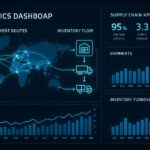
Selecting the right KPIs is foundational to a dashboard that makes a tangible difference on the factory floor. Metrics should reflect both process capability and product quality, while also capturing the reliability and efficiency of the manufacturing system. A balanced set typically includes equipment availability, production throughput, quality yield, and the rate of value-added work versus waste. The goal is to create a concise, actionable view that supports decisions at the line, plant, and enterprise levels, without overwhelming users with noise.
To organize these metrics, dashboards often group indicators into key categories that map to the major levers of performance: asset health, process efficiency, quality control, and supply chain execution. It’s common to combine a high-level KPI strip with drill-down widgets that reveal contributing factors, enabling both quick assessment and deeper investigation. Establishing targets, tolerance bands, and real-time alerts helps ensure the dashboard remains a practical tool for day-to-day management rather than a passive display of numbers.
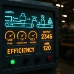
- Overall Equipment Effectiveness (OEE) and its components (Availability, Performance, Quality)
- Throughput and cycle time by line or product family
- Yield, scrap rate, first-pass quality, and defect trends
- Downtime duration, downtime reasons, and recovery time
- Inventory levels, work-in-progress, and material flow efficiency
- Maintenance reliability metrics (MTBF, MTTR) and preventive maintenance adherence
- On-time delivery, schedule adherence, and changeover efficiency
- Energy consumption and emissions aligned to production batches
When configuring KPI visualizations, practitioners should emphasize clarity over complexity. Use consistent scales, intuitive color semantics for status (green/yellow/red), and hierarchical layouts that lead the eye from strategic indicators to operational detail. For example, an executive view might feature a compact OEE gauge and a line chart of throughput, while an on-floor view emphasizes real-time sensor status and maintenance queues. The design choice should reflect the decision context and the audience’s information needs, from plant manager to supervisor to maintenance technician.
Dashboard Architecture and Visualization Techniques
Effective dashboards are built on a robust data architecture that supports accurate, timely, and secure information delivery. This means a layered approach: a data pipeline that collects, cleans, and harmonizes data from multiple sources; a semantic model that defines business terms and calculations; and a presentation layer that delivers role-based views. Real-time or near-real-time updates are increasingly expected on the shop floor, but latency-sensitive decisions may also rely on carefully batched data for consistency. The architecture should also support historical trend analysis, batch reporting, and ad-hoc exploration without compromising performance or data integrity.
In terms of visualization techniques, dashboards should leverage a mix of indicators, trends, and contextual storytelling. Key performance indicators are best shown with concise gauges or KPI tiles, while trends benefit from time-series charts that reveal seasonality, drift, or sudden shocks. For deeper analysis, employ drill-down capabilities, filterable views by production line, product family, or shift, and contextual notes that explain anomalies. Design principles such as minimizing cognitive load, ensuring legibility on tablet or mobile devices, and maintaining consistent typography help ensure the dashboard is usable across shifts and roles. When appropriate, include lightweight predictive cues—forecast lines or probability-based alerts—to support proactive maintenance and capacity planning.
{
  "dashboard": {
    "layout": "grid",
    "widgets": [
      {"type": "kpi", "title": "OEE", "value": 82.5, "target": 85},
      {"type": "line", "title": "Throughput by Hour", "series": ["Line A","Line B"]},
      {"type": "bar", "title": "Defects by Product", "categories": ["P1","P2","P3"]},
      {"type": "table", "title": "Downtime by Reason", "columns": ["Reason","Duration","Frequency"]}
    ]
  }
}
Data Quality, Real-Time Data, and Integration
A reliable manufacturing dashboard depends on high-quality, accessible data. This starts with clearly defined data contracts that specify how each metric is computed, the data sources involved, and the expected latency. Data lineage should be traceable from the dashboard back to the source systems to support audits and root-cause analysis. Data governance practices—such as role-based access, versioning of metrics, and change management—prevent ambiguity when calculations or sources evolve over time. In production environments, data latency and reliability matter as much as the visuals themselves; stale data can lead to misguided decisions and erode trust in the dashboard.
Typical data sources for production dashboards include MES for shop-floor events, SCADA and PLCs for sensor readings, ERP for planning and inventory, and quality systems for inspection results. Integrations should support both streaming updates for real-time monitoring and batch extracts for historical analysis. To optimize performance and user experience, implement data aggregation at appropriate granularities, cache frequently used aggregates, and provide optional detail-on-demand to avoid overwhelming the user with raw data. Robust error handling, automated data quality checks, and alerting for data feed gaps are essential to maintain operator confidence and ensure timely escalation when data pipelines fail.
Implementation Roadmap and Best Practices
Implementing manufacturing dashboards is a multi-disciplinary effort that blends IT, data engineering, and operations. A clear roadmap helps teams scope work, align stakeholders, and deliver value incrementally. Start by articulating the strategic objectives and translating them into concrete, measurable KPI targets. This alignment ensures subsequent technical work stays focused on outcomes that matter to production efficiency and quality. With objectives defined, move through data discovery, modeling, visualization design, and deployment in iterative cycles that allow for feedback and refinement.
Best practices emphasize governance, user engagement, and continuous improvement. Establish a lightweight, repeatable process for updating metrics as processes evolve. Invest in training and enablement so frontline users can interpret dashboards correctly and take action without external assistance. Finally, implement a maintenance plan that covers data source changes, visualization updates, performance optimization, and ongoing security reviews. When these elements are in place, dashboards become a living capability that adapts to shifts in demand, technology, and best practices while preserving consistency and trust.
- Define objectives and success metrics that align with production goals (throughput, quality, and uptime).
- Inventory data sources, data owners, and data quality requirements; establish data contracts and SLAs.
- Design a scalable data model and semantic layer that standardizes calculations across lines and shifts.
- Prototype dashboards with representative users, gather feedback, and iterate on visuals and interactions.
- Deploy with role-based access, monitoring, and performance testing; enable self-service exploration for approved users.
- Monitor data quality, governance, and adoption; refresh the roadmap based on changing processes and business priorities.
Industry Use Cases and Examples
Across industries, dashboards adapt to the specifics of processes, equipment, and regulatory requirements. In automotive manufacturing, dashboards commonly emphasize line balancing, takt time adherence, and supplier quality integration to minimize variation and ensure predictable output. Consumer electronics assembly might prioritize first-pass yield, defect clustering by station, and rapid changeover analytics to support frequent product introductions. In pharmaceuticals or life sciences, dashboards focus on batch traceability, process capability, and stringent quality controls, with emphasis on audit trails and regulatory compliance. Regardless of sector, the core objective remains consistent: transform raw shop-floor signals into timely decisions that improve availability, quality, and customer satisfaction.
Dashboards at the line level often present a granular, real-time view of equipment status, alarm history, and operator actions. Plant-level dashboards consolidate performance across lines, highlighting bottlenecks, capacity gaps, and inventory constraints. Enterprise dashboards connect manufacturing results to broader supply chain, procurement, and financial outcomes, enabling leaders to link shop-floor performance to cost of goods sold, working capital needs, and capital investment decisions. The most successful implementations tailor the visualization details to the audience while preserving a common data language, enabling cross-functional collaboration and consistent performance monitoring across the organization.
Frequently Asked Questions
What is a manufacturing dashboard and how does it differ from a report?
A manufacturing dashboard is a real-time or near-real-time visual interface designed to monitor key performance indicators and operational health across the production ecosystem. It aggregates data from multiple sources, supports drill-down analysis, and emphasizes timely action, alerts, and governance. A report, in contrast, is typically a scheduled, static or near-static compilation of data for archival or compliance purposes. Reports emphasize completeness and record-keeping, while dashboards emphasize immediacy, interpretation, and decision support.
How do you choose KPI metrics for a production dashboard?
Choose KPIs that directly reflect the ability to meet customer demand, maintain equipment, and sustain product quality. Start with high-level outcomes (throughput, OEE, on-time delivery) and then add process-specific measures that reveal root causes (changeover duration, defect rate by station, maintenance backlog). Ensure each KPI has a clear calculation, data source, target, and user who needs to act on it. Limit the set to a practical number per view and enable drill-downs for deeper analysis, so the dashboard remains focused and actionable rather than overwhelming.
What data sources are typically needed for real-time dashboards in manufacturing?
Common sources include MES for work orders and production events, SCADA/PLC systems for sensor and machine data, ERP for planning and inventory, quality management systems for inspection results, and maintenance management systems for asset health. In addition, utility meters or energy management platforms may be included to monitor consumption. The key is to establish reliable data streams, robust data governance, and a semantic layer that harmonizes measurements (for example, aligning units, time stamps, and machine identifiers) to enable accurate aggregation and comparison across lines and shifts.
How can dashboards improve OEE and throughput?
Dashboards improve OEE and throughput by providing visibility into the three OEE components—availability, performance, and quality—and by identifying root causes of losses in real time. They enable operators to detect equipment faults early, optimize maintenance scheduling, and reduce changeover time through data-driven line balancing. By surfacing bottlenecks and drift in cycle times, dashboards support proactive interventions, such as adjusting staffing, rescheduling maintenance windows, or reconfiguring production lines, ultimately increasing throughput while maintaining or improving quality.

")