Now Reading: Supply Chain Dashboard Examples (Logistics & Operations)
-
01
Supply Chain Dashboard Examples (Logistics & Operations)
Supply Chain Dashboard Examples (Logistics & Operations)
Overview: Why Supply Chain Dashboards Matter
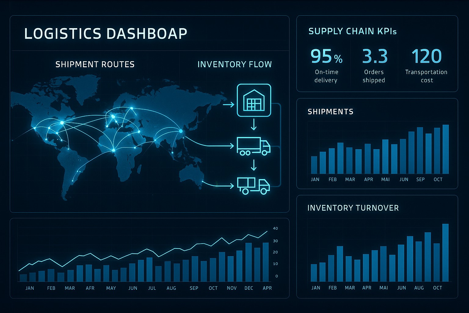
In modern logistics and operations, visibility is the backbone of proactive decision making. A well-designed dashboard aggregates data from procurement, inventory, warehousing, transportation, and customer service into a single, coherent view. This consolidated perspective enables operations teams to spot bottlenecks, forecast disruptions, and allocate resources before issues escalate. Real-time or near-real-time dashboards empower managers to respond to demand fluctuations, supplier delays, or carrier constraints with agility, reducing downstream risks and preserving service levels.
Beyond raw data, dashboards translate complex performance signals into actionable insights. They support governance by aligning day-to-day actions with strategic objectives, such as reducing total landed costs, improving order fill rates, or shortening cash-to-cash cycles. A successful dashboard also fosters cross-functional collaboration: planners, warehouse managers, and finance teams can agree on common metrics, share context for deviations, and coordinate responses across silos. The result is not only faster decisions but better alignment on the trade-offs inherent in a complex, interconnected supply chain.
Key Metrics Tracked Across Inventory, Transportation, and Fulfillment
Organizations typically monitor a layered set of metrics that span three core domains: inventory health, transportation performance, and fulfillment reliability. A holistic dashboard surface allows stakeholders to understand both the current state and evolving trends, enabling timely interventions. The following metrics are representative of a robust dashboard and are often paired with targets or benchmarks to gauge performance against expectations.
- On-hand inventory and days of supply, which indicate buffer levels and help avoid stockouts or excess carrying costs.
- Stockout rate and service level, reflecting the ability to meet customer demand without backorders.
- Inventory turnover and carrying costs, capturing how efficiently inventory is used and the cost of holding stock.
- Order cycle time, measuring the time from order placement to shipment readiness, which impacts customer satisfaction and throughput.
- Fill rate and backorder rate, signaling the completeness of order fulfillment and the risk of partial shipments.
- On-time delivery (OTD) and on-time in full (OTIF), indicating reliability of the end-to-end supply chain against promised dates.
- Transportation costs per unit and total freight spend, enabling cost control and optimization across modes and routes.
- Supplier lead time variability, assessing the stability of supplier performance and its impact on production and replenishment plans.
- Demand forecast accuracy and variance, highlighting how well plans reflect actual customer demand and where revisions are needed.
Common Dashboard Components and Design Patterns
A practical dashboard combines data architecture with visual conventions that support fast interpretation and drill-downs for deeper analysis. The design patterns emphasize consistency, discoverability, and actionable context, ensuring that users at different levels can extract the necessary insights without cognitive overload. A well-structured dashboard balances high-level summaries with the ability to investigate root causes when deviations arise.
Key components typically included in supply chain dashboards encompass data integration and a semantic layer, interactive filters and time controls, trend and benchmark visuals, geographic and network maps, alerting thresholds, and role-based views. Together, these elements help teams move from static reporting to an active information habitat where decisions are grounded in reliable data and clear context. When implemented thoughtfully, dashboards also support scenario planning and what-if analyses, enabling teams to explore the consequences of supply disruptions or capacity changes before committing to a course of action.
- Data integration layer and semantic definitions that unify metrics across disparate systems.
- Filters and time window controls (e.g., last 7 days, current quarter, rolling 12 weeks) for quick segmentation and comparative views.
- Trend charts, sparklines, and benchmark comparisons to visualize performance trajectories and relative maturity.
- Heatmaps and geographic maps that reveal regional variations, facility bottlenecks, or carrier performance by route.
- Alerts and threshold-based color-coding to flag anomalies or targets that fall outside acceptable ranges.
- Drill-down capabilities and role-based views that tailor content to the responsibilities of different users, from operators to executives.
Architectures by Role: What Each Team Sees
Dashboards are more effective when they reflect the needs and workflows of the people who use them. A role-based approach ensures that managers see the most relevant KPIs, while frontline operators receive immediate signals that trigger actions. The following table illustrates a practical distribution of KPIs, data sources, and sample widgets tailored to common roles in a supply chain organization.
| Role | Primary KPIs | Key Data Sources | Sample Widgets |
|---|---|---|---|
| Supply Chain Manager | OTIF, forecast accuracy, inventory turnover, service level | ERP, WMS, TMS, planning systems | Trend chart showing OTIF over time, heatmap of regional fill rates, KPI cards with targets |
| Operations Supervisor | OTD, cycle time, backlog, stockouts | WMS, MES, ERP | Control chart for cycle time, alert list for bottlenecks, live operations board with queue statuses |
| Logistics Planner | On-time shipments, transportation costs per unit, carrier performance, dock-to-stock time | TMS, ERP, GPS data | Map view by route and carrier, schedule-related widgets, C-Rail-like dashboard for carrier SLAs |
| Procurement Manager | Supplier lead time, supplier on-time delivery, purchase price variance, stock availability | Procurement system, ERP, supplier portal | Bar charts by supplier, supplier scorecards, table with latest lead times |
| Senior Leadership | End-to-end cycle time, service level, network inventory, COGS, cash-to-cash | ERP, BI platform, financial systems | Executive dashboard with summary cards, trend lines, and high-level variance visuals |
Implementation Considerations: Data Quality, Integration, and Performance
A dashboard is only as reliable as the data powering it. Establishing clear data governance, lineage, and quality rules is essential to ensure trust across the organization. This includes defining data owners, standardizing key definitions (such as what constitutes a “delivery completed” or a “stockout”), and implementing automated validation checks that catch anomalies before they reach end users. A strong governance foundation reduces the risk of misinterpretation and helps maintain consistency as data sources evolve.
Beyond governance, the technical design of the data model and the integration architecture determines how scalable and responsive the dashboard will be. A unified semantic layer that standardizes metrics across ERP, WMS, TMS, and planning systems helps prevent conflicting calculations and makes it easier to onboard new data sources. Efficient ETL/ELT pipelines, incremental refresh strategies, and thoughtful caching balance freshness with performance, ensuring dashboards load quickly even when the underlying data volumes grow. Finally, ongoing user engagement and training are critical: dashboards must align with actual business processes, be updated to reflect changing priorities, and be easy to interact with in real-world decision-making scenarios.
- Define target outcomes and success metrics for the dashboards aligned with business objectives and user needs.
- Establish data governance, ownership, and data quality rules to ensure consistency and trust in the metrics.
- Design a unified data model and a semantic layer that standardizes definitions across sources.
- Implement robust data integration pipelines with clear refresh cadences, monitoring, and error handling.
- Validate dashboards with representative users, pilot deployments, and iterative improvements based on feedback and adoption metrics.
FAQ
What is a supply chain dashboard?
A supply chain dashboard is a consolidated visualization that presents key performance indicators, operational metrics, and data-driven insights about the end-to-end supply chain. It harmonizes information from procurement, inventory, warehousing, transportation, and customer service to provide a single source of truth that supports timely decisions and coordinated action across teams.
How can dashboards improve responsiveness in a disrupted environment?
Dashboards surface early warning signals—such as rising lead times, stockouts, or loading delays—through real-time or near-real-time data. By presenting clear trends and thresholds, they enable managers to trigger predefined responses, reallocate capacity, adjust replenishment policies, or reroute shipments before disruptions escalate into outages, thus maintaining service levels and reducing cost volatility.
What data sources are typically used for supply chain dashboards?
Common sources include enterprise resource planning (ERP) systems, warehouse management systems (WMS), transportation management systems (TMS), supplier and procurement platforms, manufacturing execution systems (MES), and financial or planning databases. In addition, external data such as carrier performance feeds, weather data, and demand signals from customer systems can enrich dashboards, provided there is a reliable data integration framework and consistent data definitions.
How do you ensure data quality for dashboards?
Data quality is anchored in governance, lineage, and automated validation. Establish clear ownership for data domains, define standard metrics and definitions, implement validation rules at ingestion, and monitor data freshness and completeness. Regularly audit data against source systems, include reconciliation checks, and solicit user feedback to catch edge cases where data may be misinterpreted or out of date.
What are common mistakes to avoid when building dashboards?
Avoid overloading dashboards with too many metrics, which can obscure meaningful signals. Do not rely on a single data source without reconciliation, as mismatches undermine trust. Resist the temptation to duplicate reports across teams instead of designing role-based views that reflect actual responsibilities. Finally, neglecting user adoption and feedback often leads to underutilization; prioritize iterative usability testing and training to ensure dashboards drive real improvements in operations.
