Now Reading: What Is a Dashboard in Analytics? Definition and Examples
-
01
What Is a Dashboard in Analytics? Definition and Examples


Definition and purpose of a data dashboard
A data dashboard is a visual interface that consolidates critical metrics and indicators from multiple data sources into a single, at-a-glance view. It is designed to present the current state of business performance in a concise, actionable format, using charts, gauges, and tables to highlight status, trends, and anomalies. Unlike a static report, a dashboard is typically interactive, allowing users to filter data, drill into details, and explore different perspectives without leaving the page. This interactivity supports quick judgment calls and coordinated action across teams.
In practice, the dashboard’s purpose is to enable evidence-based decision making at speed. It aligns data presentation with organizational goals, surfaces exceptions before they become issues, and provides a consistent reference point for performance discussions. A well-constructed dashboard translates raw data into meaningful insight by emphasizing the most relevant metrics, maintaining clarity under complexity, and supporting both operational monitoring and strategic review. The end result is a living tool that helps leaders and frontline teams stay synchronized on what matters most.
Core components and data architecture
Dashboards are built around a set of core components: a defined set of key performance indicators (KPIs), data sources with clear lineage, and visualizations that map to the intended decisions. KPIs should be precisely defined, calculable, and aligned with business objectives. Data sources can include enterprise systems such as ERP, CRM, marketing platforms, and financial applications, as well as external data feeds. A robust dashboard also incorporates data governance considerations, including data quality checks, data timeliness, and access controls to ensure reliable and secure insights.
Beyond metrics, effective dashboards leverage interactivity to support exploration and scenario analysis. Users expect filters, drill-down paths, and the ability to compare periods or segment data by region, product line, or customer cohort. Performance depends on thoughtful data modeling, efficient data pipelines (ETL or ELT), and incremental refresh strategies that balance freshness with system load. In this sense, a dashboard is as much about the data architecture behind it as the visuals that users interact with.
Types of analytics dashboards
Organizations commonly deploy several archetypal dashboard types to serve different decision-making needs. The following categories capture how dashboards are used to monitor, analyze, and act on data across the enterprise.
- Operational dashboards — focused on real-time or near real-time monitoring of ongoing processes, such as manufacturing line throughput, site uptime, or service desk queues.
- Tactical dashboards — designed for department-level oversight, enabling managers to track project progress, resource utilization, and short-term performance against targets.
- Strategic dashboards — executive views that summarize high-level outcomes, long-term trends, and progress toward strategic goals, often aggregating across functions.
- Analytical dashboards — focused on data exploration, ad hoc analysis, and discovery of correlations, patterns, and hypotheses using deeper drill-down capabilities.
- Real-time dashboards — specialized for streaming metrics that require immediate awareness and rapid response, such as anomaly detection or incident tracking.
- Board or governance dashboards — designed for board-level oversight, risk management, and compliance indicators, typically emphasizing reliability, control, and governance metrics.
Practical examples across domains
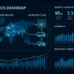
Dashboards translate domain-specific needs into visual dashboards that enable timely action. In sales, for example, a dashboard may consolidate pipeline health, win rate, and quota attainment to help managers prioritize opportunities and adjust forecasting. In marketing, dashboards often track funnel metrics, campaign ROI, and audience engagement to guide channel mix and budget allocation. In finance, dashboards summarize cash flow, variances to plan, and liquidity metrics, supporting quarterly outlooks and risk assessment. Across supply chain, IT operations, and customer support, dashboards provide visibility into throughput, incident response times, and customer satisfaction, enabling cross-functional coordination and rapid remediation when gaps appear.
- Sales performance dashboard: pipeline velocity, close rate, average deal size, and forecast accuracy.
- Marketing effectiveness dashboard: lead-to-opportunity conversion, channel ROAS, and content engagement metrics.
- Customer success health dashboard: churn risk indicators, renewal rates, and Net Promoter Score trends.
- Financial performance dashboard: budget-to-actuals, cash position, and working capital metrics.
- Operations and supply chain dashboard: on-time delivery, inventory turns, and supplier lead times.
- IT and security dashboard: system availability, incident counts, and mean time to resolution.
Design principles for effective dashboards
Effective dashboards balance clarity, relevance, and actionability. Start with a clear purpose: identify the audience, the decision it supports, and the time horizon. Choose visualizations that match the data type and the decision context—time series for trends, bar charts for comparisons, and heat maps for regional performance—while avoiding chart clutter and cognitive overload. Color should communicate status and priority without misrepresenting data; a consistent palette helps users scan and interpret quickly.
Another principle is metric discipline. Focus on a small set of strategically important KPIs aligned to goals, with explicit definitions and calculation logic. Provide context where needed, such as target lines, baselines, and recent performance versus period-over-period changes. Finally, design for accessibility and adoption: ensure the dashboard supports collaborative decision making, is responsive across devices, and includes intuitive navigation so users can quickly locate the insight they need without extensive training.
Common pitfalls and how to avoid them
Dashboards fail when they overwhelm users with noise, display inaccurate or stale data, or lack alignment with business objectives. A frequent pitfall is metric drift—KPIs that drift from the original business question or lose relevance as strategies evolve. To avoid this, implement a governance process that periodically reviews KPIs, refresh cadences, and visualization choices. Another risk is over-reliance on color and visual flair at the expense of clarity; prioritize legibility, consistent labeling, and straightforward storytelling over decorative design.
Users may also experience adoption gaps if the dashboard is not tailored to distinct roles or if data quality is unreliable. Address this by creating role-based views, establishing data lineage and metadata, and setting expectations for data timeliness and accuracy. Finally, avoid information silos by ensuring data from core systems is integrated with governance checks, so the dashboard represents a trustworthy, single source of truth that stakeholders can depend on for decision making.
Implementation considerations and best practices
Successful dashboard initiatives typically follow a structured design and delivery process. Start with stakeholder interviews to identify decision flows, required metrics, and the most important user journeys. Map data sources, perform an initial data quality assessment, and prototype a minimal viable dashboard to validate hypotheses with real users. Iterate on feedback, expand data coverage, and formalize a change-management plan to support ongoing enhancement and governance.
Practical implementation also involves performance considerations, such as data modeling, query optimization, and incremental refresh strategies to keep dashboards responsive as data volume grows. Security and access control should be built in from the outset, with role-based permissions that protect sensitive information while enabling the right users to access the insights they need. Finally, establish metrics for success beyond usage, such as time-to-insight, decision speed, and improvements in business outcomes that can be attributed to dashboard-driven actions.
Measuring success and ongoing optimization
Measuring the impact of dashboards requires a blend of usage analytics and business outcome tracking. Common indicators include adoption rates among target user groups, reductions in time spent gathering data, and the frequency with which decisions are linked to dashboard insights. It is also important to monitor data freshness and accuracy, ensuring that refresh cycles align with decision rhythms and that users trust the figures displayed. Ongoing optimization should be built into the process, with regular reviews of KPI relevance, visualization effectiveness, and cross-functional feedback that informs refinements and new capabilities.
FAQ
What is the primary difference between a dashboard and a report?
A dashboard provides a visual, interactive snapshot of current performance across multiple metrics, designed for quick understanding and ongoing monitoring. A report is typically a structured document that presents data in a static or scheduled format, often with detailed tables and narrative explanations. Dashboards emphasize real-time insight and actionable context, while reports focus on historical detail and formal documentation.
How do dashboards stay actionable for different roles?
Actionability comes from tailoring views to the needs of each role. This includes role-based access to relevant data, purpose-built dashboards for executives, managers, and front-line staff, and the ability to customize filters and drill-down paths. Clear definitions of KPIs, targets, and thresholds help ensure that the information points to concrete actions rather than just observations.
What data sources are commonly used for dashboards?
Common sources include enterprise resource planning (ERP) systems, customer relationship management (CRM) platforms, marketing analytics, financial planning systems, supply chain and logistics data, IT operations and security logs, and web or product analytics. A well-designed dashboard integrates these sources through robust data pipelines, with consistent definitions and data governance to ensure comparability across domains.
How often should dashboards be refreshed?
Refresh cadence depends on the business context. Operational and real-time dashboards may require near-instantaneous updates, while tactical or strategic dashboards can operate on hourly, daily, or multi-day refreshes. The key is to balance data freshness with system performance and user needs, ensuring decisions are supported by timely and reliable information.
How do you choose which metrics to display?
Metric selection should start with strategic goals and decision-making questions. Focus on the few metrics that most strongly drive outcomes, ensure each KPI has a clear definition and a method for calculation, and provide context such as targets and baselines. It is also important to remove redundant metrics, group related indicators logically, and consider how the metrics tell a coherent story that guides action across teams.