Now Reading: Data Visualization Best Practices for Effective Charts
-
01
Data Visualization Best Practices for Effective Charts


The purpose of data visualization and its business impact
Data visualization translates numeric data into visual representations that humans can interpret quickly. In business contexts, charts are not decorative; they are decision-support tools that inform strategy, track performance, and reveal anomalies that might require action. A well-crafted chart reduces cognitive load by aligning with how the human brain processes visual information: color, shape, and spatial arrangement help encode meaning, relationships, and trends. Poorly designed visuals, on the other hand, can obscure critical insights, exaggerate differences, or mislead stakeholders about risk and probability. The goal is to maximize fidelity—accuracy of the underlying data—while minimizing distortion introduced by the visual form.
Effective visualization is as much about communication as it is about data.
To achieve this balance, practitioners should build visuals around a clear message, consider the audience’s background, and align the chart with the decision context. This means choosing chart types that match the data structure, labeling axes consistently, and avoiding gratuitous embellishments that do not add information. In enterprise environments, visuals should also comply with governance standards, be reproducible from source data, and be easy to audit. In short, data visualization is a collaborative process that pairs data literacy with thoughtful presentation to drive action rather than mere recognition.
Choosing chart types for clarity and accuracy
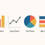
The choice of chart type should reveal the nature of the data and the relationship you want to illuminate. If you need to compare categories at a fixed point in time, a bar or column chart offers a straightforward comparison. For trends across time, line charts help viewers discern direction and rate of change, while avoiding the temptation to overlay multiple time series without clear separation. When exploring relationships between two quantitative variables, scatter plots can show correlation and dispersion, but they require careful axis labeling and consistent scales. For distributions, histograms or density plots make it possible to assess frequency and skew without forcing assumptions about shape.
To ensure accuracy, designers should prefer simple, conventional encodings over novel but untested visuals. Always check axis scales, tick marks, and labeling for consistency, and avoid truncating axes in ways that exaggerate differences. A single chart should carry a single, coherent message, supported by annotations or captions that provide context. When multiple charts are used in a dashboard, ensure that the visual language—color palette, typography, and axis treatment—remains consistent across the set to prevent cognitive dissonance among viewers.
| Chart Type | Ideal Use | Common Pitfalls |
|---|---|---|
| Bar/Column | Category comparisons | Too many categories; inconsistent scales |
| Line | Trends over time | Overplotting; multiple series without clarity |
| Scatter | Relationship between two variables | Non-linear patterns hidden; inappropriate axis scales |
| Histogram | Distribution of a variable | Misleading bin size; unequal bin ranges |
Visual encoding: color, size, and position
Visual encoding choices shape how audiences interpret the data. Color should differentiate categories or encode magnitude with a perceptually uniform palette. When color is used to indicate category, a small set (2-6 distinct hues) helps avoid confusion. For quantitative values, consider a perceptually uniform ramp where luminance conveys magnitude rather than relying solely on hue. Size and position are equally critical: use size to reflect relative magnitude only when it preserves readability, and position is typically the most reliable cue because humans compare aligned visual anchors more accurately than length or area.
To maximize comprehension, avoid gradient color maps that misrepresent small differences, and never rely on color alone to convey meaning. Include alternative cues such as shape, labels, or texture to support readers with color vision deficiencies. When presenting charts in print or on screens with varying brightness, test how your encodings hold up under different conditions. The bottom line is to design with accessibility in mind so that the chart remains legible, interpretable, and actionable across audiences and environments.
- Favor a limited color palette and use color to differentiate categories or quantify values only where appropriate.
- Avoid color combinations that are problematic for color-blind readers (for example, red-green pairings).
- Use consistent color mappings across charts in the same dashboard or report.
- Prefer distinct hues for categorical distinctions; use perceptual luminance ramps for quantitative scales.
- Test encodings with representative users to confirm interpretability.
- Document the color legend and the data mapping clearly within the visualization’s caption or metadata.
Labeling, axes, and scales
Labels, axes, and scales anchor interpretation. A chart without clear axis labels forces readers to guess what the numbers represent, which introduces misinterpretation and errors. Always include the variable name, units, and a succinct description of what is being measured. Tick marks should be evenly spaced with consistent intervals; avoid squashing or stretching axes to exaggerate differences. When a chart requires multiple axes or a dual-axis setup, provide explicit guidance in the caption and ensure the scales are aligned so that comparisons remain valid.
Clarity extends to legends, captions, and gridlines. Legends should be placed where readers instinctively look to identify color or marker meanings, and captions should summarize the key takeaway in a single sentence. Gridlines should be present but unobtrusive, helping readers gauge values without creating visual clutter. Data-ink efficiency matters: remove non-essential elements that do not contribute to understanding, such as redundant tick marks or heavy borders. Finally, consider the context in which the chart will be consumed and adapt axis labeling for different devices or formats, from dashboards to executive briefings.
- Label axes with clear, concise names and units (e.g., “Revenue (USD millions)”).
- Provide a legend that is easy to locate and interpret; keep it up-to-date with data mappings.
- Keep tick marks evenly spaced and avoid misleading scale distortions.
- Use a single axis scale for comparable charts to facilitate quick comparisons.
- Include a descriptive caption that explains the chart’s purpose and data source.
Quality control: validation, testing, and accessibility
Quality control ensures that visuals reliably represent the underlying data and that stakeholders can trust what they see. Validation should start from the data source: confirm the extraction, cleaning, and aggregation steps, and track any transformations applied to the data. Visuals should be reproducible from the dataset and code that produced them, enabling audits and updates as new data arrives. Inconsistent data or hidden errors are the primary drivers of misleading visuals, so a rigorous review process helps safeguard decision-making across departments.
Testing with real users and across devices helps uncover practical issues that do not surface in isolation. Gather feedback on readability, interpretability, and perceived bias, and refine accordingly. Accessibility testing—color contrast checks, keyboard navigation, and screen reader compatibility—ensures that visuals are usable by a broad audience, including people with disabilities. Documentation that records assumptions, data provenance, and rendering logic also supports governance and compliance. The result is a visualization that not only looks professional but also stands up to scrutiny in formal reviews and audits.
- Verify data sources and transformations to ensure the chart reflects the intended dataset.
- Validate visual encodings against defined mappings to prevent misinterpretation.
- Test the chart with representative users and collect actionable feedback.
- Check color contrast and accessibility features for inclusivity.
- Maintain documentation that traces data lineage and rendering steps.
Workflow from data to chart: a practical approach
Operationalizing data visualization begins with a disciplined workflow that translates raw data into reliable visuals. Start with a clear objective, define the audience, and determine the key questions the chart must answer. Next, gather data from trusted sources, perform cleaning and normalization, and agree on the metrics that will drive the narrative. Prototyping early with rough visuals helps validate the approach before investing in polished designs, and versioning ensures that changes can be tracked over time. A repeatable process reduces friction when data updates arrive and helps teams maintain consistency across reports and dashboards.
In practice, teams often adopt a lightweight tooling stack that supports rapid iteration: data extraction and transformation, chart rendering, and governance checks in a single workflow. Document the assumptions behind each visualization, and store artifacts such as data dictionaries, charts, and captions in a shared repository. The end result is a scalable, auditable process that fosters collaboration between data analysts, product managers, and executives, ensuring that every chart carries the same level of rigor as any other business artifact.
# Simple example of a chart workflow (pseudocode)
data = load_source('sales.csv')
clean = clean_data(data)
summary = summarize_by_month(clean)
chart = render_line_chart(summary, x='month', y='revenue')
publish(chart, destination='dashboard')
FAQ
What is the most important principle for effective charts?
The most important principle is clarity paired with accuracy: ensure the chart communicates a single, well-supported message, and verify that the visual encoding faithfully represents the underlying data to avoid misinterpretation.
How can I ensure accessibility in data visuals?
Ensure accessibility by checking color contrast, providing text alternatives for color distinctions, using clear labels and captions, and designing for keyboard and screen-reader compatibility so that a broad audience can interpret the visuals without barriers.
What should you do when data complexity clashes with simplicity?
When complexity threatens simplicity, break the narrative into a sequence of focused visuals, use progressive disclosure, and provide captions or annotations that guide interpretation. The goal is to empower readers to grasp the core insight first, with deeper details available as needed.
")