Now Reading: How to Design an Effective Dashboard (Best Practices)
-
01
How to Design an Effective Dashboard (Best Practices)

")
Understanding dashboard goals and audience
Effective dashboards are not mere collections of numbers; they are decision-support systems that guide action. Before you design a single visualization, articulate the core question the dashboard will answer and identify the primary users who will rely on it. Map the dashboard to strategic objectives such as revenue growth, customer retention, or operational resilience, and define success in observable terms like faster decisions, fewer escalations, or improved cross-functional alignment. In practice, this means creating a clear scope, choosing the right level of detail, and establishing a narrative that users can follow from top-line guidance to the supporting data.
Different roles require different lenses, so you should tailor views to the needs of executives, analysts, and frontline operators. Executives often want a crisp summary with the ability to drill into root causes, analysts require richer data sources and robust filtering, and operators typically need near real-time status with actionable alerts. To avoid cognitive overload, design around a single story per view, use consistent terminology, and ensure legends and axis labels are unambiguous. Start with a strong takeaway on each screen and provide a path to deeper data rather than presenting everything at once.
– Monitor performance against targets
– Detect anomalies quickly and alert when thresholds are breached
– Compare current results with prior periods to identify trends
– Drill into root causes with contextual data
– Support timely decision-making across teams and functions
Metrics and data selection
Choosing the right metrics is the foundation of an effective dashboard. Each metric should be actionable and clearly linked to a business outcome. Define precise calculations, ensure consistent units of measure, and align time windows across metrics so comparisons are meaningful. Limit the number of core metrics to reduce cognitive load, and provide context through filters and drill-downs rather than overwhelming users with every possible figure. A well-designed dashboard uses a small set of truly decision-relevant measures to tell a coherent story.
Data governance and quality are critical ongoing considerations. The dashboard must reflect data that users can trust, with transparency about data sources, calculation rules, and any data latency. Establish ownership for each metric, implement data quality checks, and document definitions in a shared glossary to minimize misinterpretation. Build a feedback loop with stakeholders so metrics can be refined as business needs evolve and data systems mature. When new metrics are introduced, pilot them in a sandbox environment and gather user input before production deployment.
– Core financial metrics (revenue, gross margin, contribution margin)
– Operational metrics (cycle time, throughput, utilization)
– Customer metrics (satisfaction, retention, churn)
– Quality and risk metrics (defect rate, incident count, safety)
– Efficiency and cost metrics (cost per unit, energy usage, waste)
-- Example: simple KPI calculation (pseudo-SQL)
SELECT
  DATE_TRUNC('month', order_date) AS month,
  SUM(total_amount) AS revenue,
  SUM(cost) AS cost,
  SUM(total_amount) - SUM(cost) AS profit
FROM orders
WHERE order_date >= CURRENT_DATE - INTERVAL '12 months'
GROUP BY DATE_TRUNC('month', order_date)
ORDER BY month;
Layout and visual hierarchy
Layout decisions should guide the viewer from high-level insight to supporting detail, reducing cognitive load and supporting a clear narrative. Use a clean grid, consistent card sizes, and a logical flow that mirrors decision steps. Limit color usage to a focused palette that differentiates axes and highlights critical values, and provide a concise, outcome-oriented label for every panel. Place the top-line summary in the most prominent position, typically at the top-left, and design for easy scanning so users can quickly determine what requires attention and where to take action.
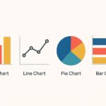
When selecting visuals, match the data to the most effective chart type. Trend data benefits from line charts, comparisons from bar charts, distributions from histograms, and geographic information from maps when relevant. Where possible, add sparklines or compact trend indicators adjacent to the main charts to give context without forcing extra navigation. Keep axis labels legible and avoid decorative, non-informative graphics. Each panel should convey a single story and offer a clear call-to-action, such as “Investigate” or “Approve,” to drive decision-making.
1) Start with a top-line summary and clear destination actions
2) Group related metrics into panels or cards
3) Use consistent color coding and typography across the dashboard
4) Provide drill-down paths and contextual filters to explore data
5) Design for different devices and screen sizes, prioritizing core views
6) Avoid over-aggregation and clutter that obscure meaning
Data storytelling and narrative
Dashboards should tell a coherent narrative, not merely display numbers. Begin with a question or hypothesis and present the data that supports or challenges it, then guide the viewer toward actionable conclusions. Structure the view so the viewer moves from context to insight to action, with every chart carrying a clear takeaway. When anomalies appear, supply the necessary context or commentary so the viewer understands why something happened and what to do about it.
Annotations, legends, and concise captions help prevent misinterpretation. Use a consistent caption format for similar metrics and avoid jargon that unfamiliar users might not understand. A well-crafted narrative also includes explicit next steps or decisions to be made, ensuring the dashboard serves as a decision-support tool rather than a passive display.
– Use a short, readable block of context at the top of each panel
– Keep legend text brief and aligned with chart visuals
– Provide a single, clear takeaway per visualization
– Add inline annotations for noteworthy events or changes
– Ensure color semantics convey meaning beyond aesthetics
– Validate the story with stakeholders through iterative reviews
Effective dashboards tell the story behind the numbers, not just display them. Focus on causality, context, and readability.
Implementation and governance
After the design is validated, implement a repeatable production process that covers data pipelines, data modeling, and dashboard release management. Clearly define roles for data owners, dashboard owners, and audience-specific access, and establish a change-control workflow so improvements or bug fixes are tracked and communicated. A disciplined approach to governance reduces drift between what the data represents and what the dashboard shows over time.
Operational practices should include a release calendar, automated tests for data quality, and monitoring for data freshness and dashboard uptime. Document calculation rules and maintain a central glossary so new users can understand how numbers are produced. Use sandbox environments for testing new metrics or visualizations before promoting them to production dashboards, and solicit periodic user feedback to ensure ongoing relevance.
// Example: simple configuration snippet (pseudo)
dashboard: {
  refresh_interval: 15,
  data_source: "sales_db",
  owners: ["Alice Johnson", "Miguel Chen"],
  access_roles: ["executive", "analyst", "operator"]
}
Accessibility and performance
Make dashboards accessible to a diverse audience by adopting accessible color contrasts, providing keyboard navigation, and ensuring compatibility with screen readers for charts and controls. Clear labeling, alternative text for visuals, and logical tab order are essential for inclusive design. Performance should be a primary consideration in every stage, from data modeling to rendering.
Optimization techniques include incremental data loading, caching frequently accessed queries, and paginating large datasets without sacrificing a meaningful first impression. Set measurable performance targets for data latency and render times, and implement monitoring to alert when thresholds are exceeded. By balancing accessibility with performance, you ensure the dashboard remains usable and reliable for all users, regardless of device or bandwidth constraints.
FAQ
Who is the dashboard intended for?
The dashboard should be designed to serve multiple personas, including executives seeking high-level indicators, managers who monitor operational health, and analysts who investigate root causes. Each persona should have a tailored view with appropriate levels of detail, filters, and interaction options that align with their decision-making responsibilities.
What metrics should I start with?
Begin with a small set of core, actionable KPIs that directly tie to strategic objectives. Prefer leading indicators over vanity metrics and ensure each metric has a clear definition and a known data source. As users gain comfort, you can gradually introduce additional metrics with careful documentation and governance.
How can I measure dashboard effectiveness?
Track adoption metrics such as unique users and frequency of use, time-to-insight for common decisions, and explicit business impact through user feedback and outcome measures. Periodic reviews with stakeholders help validate that the dashboard remains aligned with evolving goals and data capabilities.
How do I handle data quality issues?
Establish data lineage, ownership, and automated quality checks, with clear escalation paths when issues arise. Display data quality indicators on the dashboard where appropriate, and maintain a glossary of definitions and calculation rules so users understand how figures are produced.
What is the recommended update cadence?
Cadence should reflect the decision speed required by the audience. High-stakes, operational dashboards often benefit from near real-time or hourly updates, while strategic dashboards may be refreshed daily. Set expectations with users and ensure data refreshes are reliable and well-communicated.